There is a unique kind of magic in creating something from nothing. In the digital world, nothing beats the feeling of writing a few lines of text, refreshing your browser, and watching a vibrant, interactive website come to life.
Whether you want to showcase your freelance portfolio, build a digital resume, or just establish your corner of the internet, building your own website is the ultimate power move. And no, you don’t need expensive subscription builders to do it.
Today, we are stripping away the complexity. This is your complete, step-by-step guide to building a modern, fully responsive personal website using the core languages of the web: HTML, CSS, and JavaScript.
Plus, we’ve included the exact blueprint code at the bottom that you can copy, paste, and launch today.
The Tech Stack: The Core Triad
Before we touch the keyboard, let’s look at the three tools we will be using. Think of building a website like building a house:
- HTML5 (The Skeleton): This defines the structure. It tells the browser, “This is a heading, this is a paragraph, and this is a button.”
- CSS3 (The Interior Design): This brings the style. It controls the colors, layout, spacing, typography, and how things shift when viewed on a mobile phone.
- JavaScript (The Electricity): This adds functionality. When a user clicks a button to change from Light Mode to Dark Mode, JavaScript is the engine making that happen behind the scenes.
Step 1: Setting Up Your Developer Environment
You don’t need fancy software to write code. In fact, you can do it in a basic text editor, but using the right tools will make your life infinitely easier.
- Download a Code Editor: Download and install Visual Studio Code (VS Code). It is completely free, lightning-fast, and the industry standard for developers.
- Create Your Project Folder: Create a new folder on your desktop and name it
personal-website. - Generate Your Files: Open VS Code, select File > Open Folder, and open your
personal-websitefolder. Inside, create three distinct files. Make sure to name them exactly as written:index.htmlstyle.cssscript.js
💡 Pro-Tip: Inside VS Code, go to the Extensions tab (the four squares icon on the left) and search for Live Server. Install it. This extension lets you view your website live in your browser and automatically updates the page every single time you hit save.
Step 2: The Blueprint Code
Copy and paste the following code snippets into your respective files in VS Code.
1. The Structure (index.html)
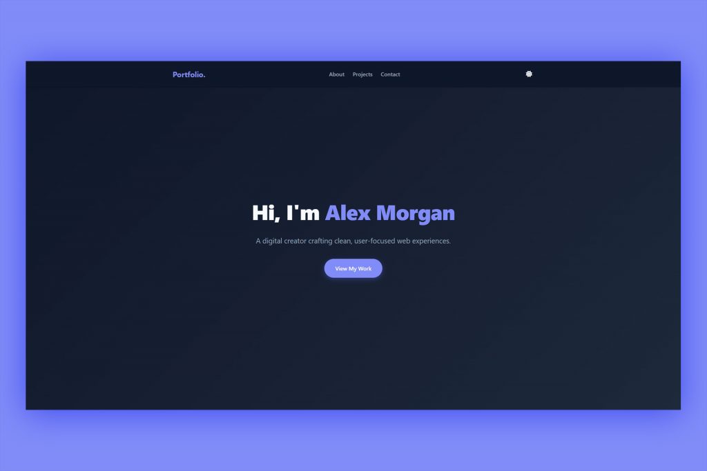
This file houses your content. It includes a navigation bar, a hero introduction, an about section with skill badges, a project showcase layout, and a contact form.
<!DOCTYPE html>
<html lang="en">
<head>
<meta charset="UTF-8">
<meta name="viewport" content="width=device-width, initial-scale=1.0">
<title>Your Name | Portfolio</title>
<!-- Link to external CSS styling -->
<link rel="stylesheet" href="style.css">
<!-- FontAwesome for clean, modern icons -->
<link rel="stylesheet" href="https://cdnjs.cloudflare.com/ajax/libs/font-awesome/6.4.0/css/all.min.css">
</head>
<body>
<!-- Navigation Bar -->
<nav class="navbar">
<div class="nav-container">
<a href="#" class="logo">Portfolio.</a>
<ul class="nav-links">
<li><a href="#about">About</a></li>
<li><a href="#projects">Projects</a></li>
<li><a href="#contact">Contact</a></li>
</ul>
<button id="theme-toggle" aria-label="Toggle Dark/Light Mode">
<i class="fas fa-moon"></i>
</button>
</div>
</nav>
<!-- Hero Section -->
<header class="hero">
<div class="hero-content">
<h1>Hi, I'm <span class="highlight">Alex Morgan</span></h1>
<p>A digital creator crafting clean, user-focused web experiences.</p>
<a href="#projects" class="btn">View My Work</a>
</div>
</header>
<!-- About Section -->
<section id="about" class="section">
<div class="container">
<h2>About Me</h2>
<div class="about-text">
<p>I specialize in building clean layouts, optimizing local SEO, and creating seamless interfaces. I bridge the gap between complex code and beautiful design to help ideas thrive online.</p>
<div class="skills">
<span class="skill-badge">HTML5</span>
<span class="skill-badge">CSS3</span>
<span class="skill-badge">JavaScript</span>
<span class="skill-badge">UI/UX Design</span>
<span class="skill-badge">Responsive Layouts</span>
</div>
</div>
</div>
</section>
<!-- Projects Section -->
<section id="projects" class="section alt-bg">
<div class="container">
<h2>Featured Projects</h2>
<div class="project-grid">
<!-- Project Card 1 -->
<div class="project-card">
<div class="project-info">
<h3>E-Commerce Interface</h3>
<p>A fast, modern digital storefront featuring minimal layout structures and fluid responsiveness.</p>
<a href="#" class="project-link">View Case Study <i class="fas fa-arrow-right"></i></a>
</div>
</div>
<!-- Project Card 2 -->
<div class="project-card">
<div class="project-info">
<h3>Dynamic Analytics Hub</h3>
<p>An intuitive UI dashboard optimizing data presentation through interactive user elements.</p>
<a href="#" class="project-link">View Case Study <i class="fas fa-arrow-right"></i></a>
</div>
</div>
</div>
</div>
</section>
<!-- Contact Section -->
<section id="contact" class="section">
<div class="container">
<h2>Let's Connect</h2>
<p class="contact-subtitle">Have a project or a fresh concept in mind? Let's bring it to life.</p>
<form class="contact-form" onsubmit="event.preventDefault(); alert('Message sent successfully! (Demo Form)');">
<div class="form-group">
<input type="text" placeholder="Your Name" required>
</div>
<div class="form-group">
<input type="email" placeholder="Your Email" required>
</div>
<div class="form-group">
<textarea placeholder="Your Message" rows="5" required></textarea>
</div>
<button type="submit" class="btn">Send Message</button>
</form>
</div>
</section>
<!-- Footer -->
<footer>
<p>© 2026 Alex Morgan. All rights reserved.</p>
<div class="social-icons">
<a href="#"><i class="fab fa-github"></i></a>
<a href="#"><i class="fab fa-linkedin"></i></a>
<a href="#"><i class="fab fa-twitter"></i></a>
</div>
</footer>
<!-- Link to external JavaScript functionality -->
<script src="script.js"></script>
</body>
</html>2. The Aesthetics (style.css)
This file uses modern CSS Custom Properties (Variables) to manage a full light-and-dark theme system. It also implements a sleek “Glassmorphism” effect for card layouts and ensures smooth transitions when changing themes.
/* --- CSS Variable Management (Themes) --- */
:root {
    --bg-primary: #ffffff;
    --bg-secondary: #f8f9fa;
    --text-primary: #1e293b;
    --text-secondary: #64748b;
    --accent: #6366f1;
    --accent-hover: #4f46e5;
    --card-bg: #ffffff;
    --shadow: rgba(0, 0, 0, 0.05);
    --transition: all 0.3s cubic-bezier(0.4, 0, 0.2, 1);
}

[data-theme="dark"] {
    --bg-primary: #0f172a;
    --bg-secondary: #1e293b;
    --text-primary: #f8fafc;
    --text-secondary: #94a3b8;
    --accent: #818cf8;
    --accent-hover: #6366f1;
    --card-bg: #1e293b;
    --shadow: rgba(0, 0, 0, 0.4);
}

/* --- Global Resets & Mechanics --- */
* {
    margin: 0;
    padding: 0;
    box-sizing: border-box;
}

html {
    scroll-behavior: smooth;
}

body {
    font-family: system-ui, -apple-system, BlinkMacSystemFont, 'Segoe UI', Roboto, sans-serif;
    background-color: var(--bg-primary);
    color: var(--text-primary);
    line-height: 1.7;
    transition: var(--transition);
}

.container {
    max-width: 1100px;
    margin: 0 auto;
    padding: 0 24px;
}

/* --- Navigation Layout --- */
.navbar {
    position: fixed;
    top: 0;
    left: 0;
    width: 100%;
    background: var(--bg-primary);
    box-shadow: 0 1px 3px var(--shadow);
    z-index: 1000;
    transition: var(--transition);
}

.nav-container {
    display: flex;
    justify-content: space-between;
    align-items: center;
    max-width: 1100px;
    margin: 0 auto;
    padding: 18px 24px;
}

.logo {
    font-size: 1.4rem;
    font-weight: 700;
    color: var(--accent);
    text-decoration: none;
    letter-spacing: -0.5px;
}

.nav-links {
    display: flex;
    list-style: none;
    gap: 24px;
}

.nav-links a {
    text-decoration: none;
    color: var(--text-secondary);
    font-weight: 500;
    transition: var(--transition);
}

.nav-links a:hover {
    color: var(--accent);
}

#theme-toggle {
    background: none;
    border: none;
    color: var(--text-primary);
    cursor: pointer;
    font-size: 1.1rem;
    padding: 6px;
    transition: var(--transition);
}

/* --- Hero Frame --- */
.hero {
    height: 100vh;
    display: flex;
    align-items: center;
    justify-content: center;
    text-align: center;
    background: linear-gradient(135deg, var(--bg-primary) 0%, var(--bg-secondary) 100%);
    padding: 0 24px;
}

.hero-content h1 {
    font-size: 3.8rem;
    font-weight: 800;
    letter-spacing: -1px;
    margin-bottom: 16px;
}

.highlight {
    color: var(--accent);
}

.hero-content p {
    font-size: 1.3rem;
    color: var(--text-secondary);
    max-width: 580px;
    margin: 0 auto 36px auto;
}

.btn {
    display: inline-block;
    padding: 14px 32px;
    background-color: var(--accent);
    color: white;
    text-decoration: none;
    border-radius: 50px;
    font-weight: 600;
    border: none;
    cursor: pointer;
    transition: var(--transition);
    box-shadow: 0 4px 14px rgba(99, 102, 241, 0.4);
}

.btn:hover {
    background-color: var(--accent-hover);
    transform: translateY(-2px);
}

/* --- General Structure Global Rules --- */
.section {
    padding: 120px 0;
}

.alt-bg {
    background-color: var(--bg-secondary);
}

.section h2 {
    text-align: center;
    font-size: 2.4rem;
    font-weight: 700;
    margin-bottom: 48px;
}

/* --- About Me Block --- */
.about-text {
    max-width: 720px;
    margin: 0 auto;
    text-align: center;
    font-size: 1.15rem;
    color: var(--text-secondary);
}

.skills {
    display: flex;
    flex-wrap: wrap;
    justify-content: center;
    gap: 12px;
    margin-top: 36px;
}

.skill-badge {
    background: var(--bg-secondary);
    color: var(--text-primary);
    padding: 8px 18px;
    border-radius: 30px;
    font-size: 0.9rem;
    font-weight: 500;
    border: 1px solid var(--shadow);
}

/* --- Project Grid Cards --- */
.project-grid {
    display: grid;
    grid-template-columns: repeat(auto-fit, minmax(300px, 1fr));
    gap: 32px;
}

.project-card {
    background: var(--card-bg);
    border-radius: 16px;
    box-shadow: 0 10px 25px var(--shadow);
    border: 1px solid var(--shadow);
    transition: var(--transition);
    padding: 36px;
}

.project-card:hover {
    transform: translateY(-6px);
    box-shadow: 0 15px 30px var(--shadow);
}

.project-info h3 {
    font-size: 1.4rem;
    margin-bottom: 12px;
}

.project-info p {
    color: var(--text-secondary);
    font-size: 1rem;
    margin-bottom: 24px;
}

.project-link {
    color: var(--accent);
    text-decoration: none;
    font-weight: 600;
    font-size: 0.95rem;
    display: inline-flex;
    align-items: center;
    gap: 8px;
}

/* --- Contact Core Layout --- */
.contact-subtitle {
    text-align: center;
    color: var(--text-secondary);
    margin-bottom: 40px;
    font-size: 1.1rem;
}

.contact-form {
    max-width: 580px;
    margin: 0 auto;
}

.form-group {
    margin-bottom: 24px;
}

.contact-form input,
.contact-form textarea {
    width: 100%;
    padding: 16px;
    border: 1px solid var(--shadow);
    border-radius: 12px;
    background: var(--card-bg);
    color: var(--text-primary);
    font-family: inherit;
    font-size: 1rem;
    transition: var(--transition);
}

.contact-form input:focus,
.contact-form textarea:focus {
    outline: none;
    border-color: var(--accent);
    box-shadow: 0 0 0 4px rgba(99, 102, 241, 0.15);
}

.contact-form .btn {
    width: 100%;
}

/* --- Global Footer Elements --- */
footer {
    text-align: center;
    padding: 48px 24px;
    background: var(--bg-secondary);
    border-top: 1px solid var(--shadow);
}

footer p {
    color: var(--text-secondary);
    margin-bottom: 20px;
}

.social-icons a {
    color: var(--text-secondary);
    font-size: 1.4rem;
    margin: 0 12px;
    transition: var(--transition);
}

.social-icons a:hover {
    color: var(--accent);
}

/* --- Basic Responsive Adaptations --- */
@media (max-width: 768px) {
    .hero-content h1 { font-size: 2.6rem; }
    .nav-links { display: none; } /* Kept clean for single-page standard display */
    .section { padding: 80px 0; }
}
3. The Interactive Logic (script.js)
This engine checks whether a visitor’s computer has dark mode preferred by default, saves their customized user toggle preference directly to their browser memory (localStorage), and handles changing the interface instantly.
// Grab theme switch toggle triggers
const themeToggleBtn = document.getElementById(‘theme-toggle’);
const themeIcon = themeToggleBtn.querySelector(‘i’);
// Evaluate historical preferences or local operating system standards
const savedTheme = localStorage.getItem(‘theme’);
const systemPrefersDark = window.matchMedia(‘(prefers-color-scheme: dark)’).matches;
if (savedTheme === ‘dark’ || (!savedTheme && systemPrefersDark)) {
document.documentElement.setAttribute(‘data-theme’, ‘dark’);
themeIcon.className = ‘fas fa-sun’;
} else {
document.documentElement.setAttribute(‘data-theme’, ‘light’);
themeIcon.className = ‘fas fa-moon’;
}
// Attach Event Handler to track switching actions
themeToggleBtn.addEventListener(‘click’, () => {
const currentTheme = document.documentElement.getAttribute(‘data-theme’);
let newTheme = ‘light’;
if (currentTheme === 'light') {
    newTheme = 'dark';
    themeIcon.className = 'fas fa-sun';
} else {
    themeIcon.className = 'fas fa-moon';
}

document.documentElement.setAttribute('data-theme', newTheme);
localStorage.setItem('theme', newTheme);
});
Step 3: Making It Yours
Once the files are saved, go ahead and personalize the experience. Here are the core areas to focus on:
- The Text: Swap out “Alex Morgan” for your name. Update the about description to match your real-world background.
- The Skills: Change out the skill badges in the HTML file (
<span class="skill-badge">...</span>) to match your professional superpowers. - The Colors: Open
style.css, scroll to the top under:root, and modify the--accenthexadecimal color value to your personal favorite color branding code.
See the Pen Personal Website Template V1 – HTML/CSS/JS by WeDesignMarbella (@we-design-marbella) on CodePen.
Step 4: Going Live (For Free!)
Having a local site sitting inside a private folder on your hard drive is cool, but letting the entire digital world access it is the goal.
You do not need paid hosting companies just to publish static code files. Instead, use a developer-loved platform called Netlify:
- Wrap up your edits and save your files inside your main folder.
- Head over to Netlify and register for a completely free starter account.
- Once logged in, click on the Sites tab and look for the box that reads: “Want to deploy a new site without connecting to Git? Drag and drop your site folder here.”
- Drag your entire
personal-websitefolder and drop it right into that window.
Within mere seconds, Netlify will process your HTML, CSS, and JS files, provision an automatic secure SSL certificate (the little padlock next to your URL), and give you a public web link. You can customize the name of your link for free inside your site settings panels, or connect your own personalized .com domain name whenever you are ready to expand.
How to create a high-converting website homepage
Top tools for web designers and developers
Building a Creative Menu Navigation with CSS & JavaScript
