
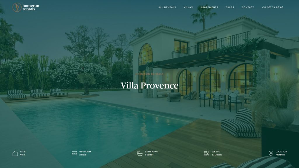
The web never stands still. In 2026, the sites that win aren’t just the prettiest — they’re the fastest, the most intuitive, and the most human. Here’s what’s shaping the digital landscape right now.
Introduction
Web design is no longer a discipline you can master once and coast on forever. Every year, shifts in technology, user behavior, and cultural aesthetics push designers to rethink what “good” looks like. And 2026 is no exception.
The trends dominating this year aren’t superficial style choices. They’re responses to real pressures: AI-accelerated development pipelines, growing demand for accessibility, shrinking attention spans, and an increasingly mobile-first world. Understanding them isn’t optional for anyone building a digital presence — it’s a competitive necessity.
In this article, we break down the top web design trends to watch this year, why each one is gaining momentum, and what you can do to apply them to your own projects.
1. Bento Grid Layouts
If you’ve spent any time on Product Hunt or browsing tech company landing pages in 2026, you’ve seen the bento grid everywhere. Named after the Japanese lunch box with its clean compartmentalized sections, bento layouts organize content into asymmetric, modular cards that tile together in a visually satisfying way.
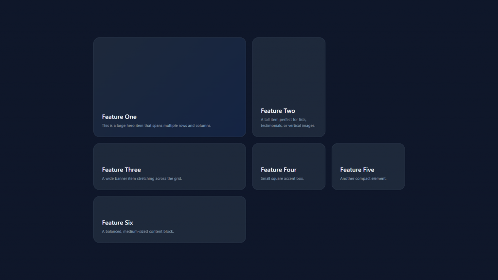
What makes bento grids so appealing right now is how well they work at every screen size. Rather than a single wide hero image that loses impact on mobile, bento layouts allow designers to prioritize and resize cards fluidly. They also give content a sense of hierarchy without relying heavily on typography — the size and position of each tile does the heavy lifting.
Apple’s product pages popularized the format at scale, but independent studios and boutique agencies have since adopted it widely. Agencies like We Design Marbella have been building bento-influenced layouts for service brands that want to communicate multiple value propositions without overwhelming the reader.
How to apply it: Think of your homepage content as a set of modular cards. Group related features, testimonials, and CTAs into distinctly sized tiles. Use contrast in card size (not just color) to signal importance.
2. AI-Personalized Interfaces
Static websites are increasingly becoming the exception. In 2026, personalization at the interface level has moved from enterprise SaaS into mainstream web design. AI layers now power dynamic homepages that adapt headline copy, hero images, and even navigation labels based on referral source, geographic region, or past browsing behavior.
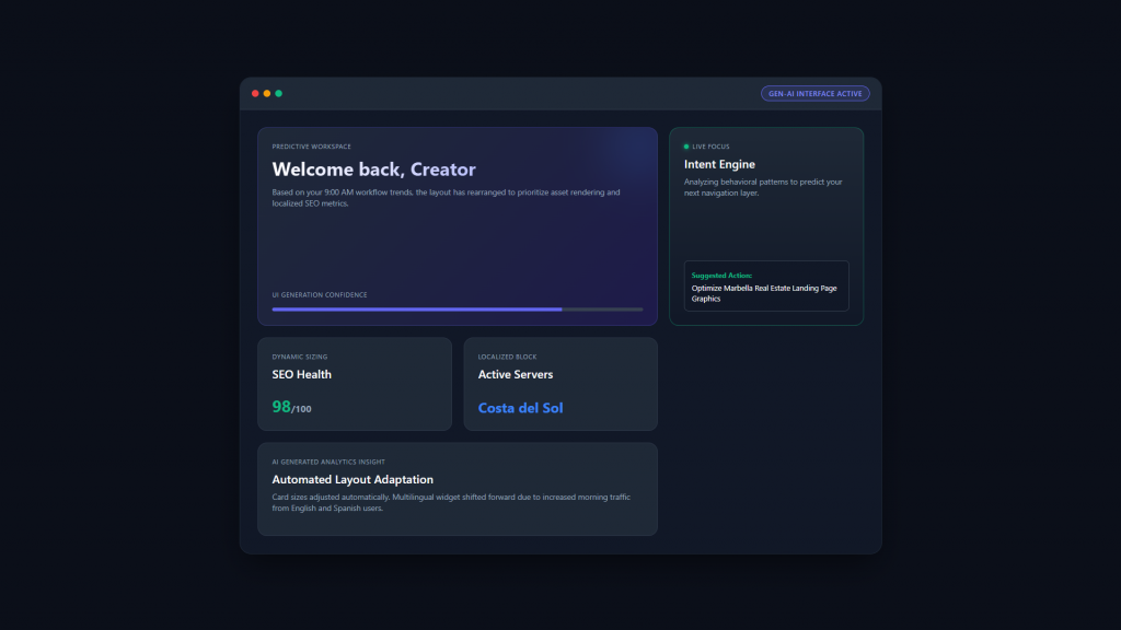
This isn’t magic — it’s the result of machine learning models sitting between the CMS and the rendered page, swapping in contextually relevant content in milliseconds. Tools like Mutiny, Adobe Target, and increasingly native features within website builders are making this accessible to smaller businesses.
The design challenge is building systems that remain coherent regardless of which variant a user sees. That means designing with modular components and content slots rather than fixed layouts. The visual language has to stay consistent even when the words and images shift.
Why it matters: Users who see personalized content convert at dramatically higher rates. If your homepage speaks to “luxury villa owners in coastal Spain” versus “startup founders in Berlin” with meaningfully different copy, both audiences feel seen — and that feeling converts.
3. Motion Design as a Core Language
Motion has graduated from a finishing touch to a primary communication layer. In 2026’s best interfaces, animation doesn’t decorate the experience — it explains it. Micro-animations confirm actions, scroll-triggered reveals guide reading order, and looping background motion creates atmosphere without video overhead.
The shift is partly technical. The widespread adoption of CSS scroll-linked animations, the maturation of libraries like GSAP and Framer Motion, and the growing availability of Lottie files have made sophisticated motion achievable without massive performance costs. Designers no longer have to choose between beauty and speed.
But the cultural driver is equally important: users have been trained by TikTok, Reels, and YouTube Shorts to expect movement. A completely static website now feels inert — like reading a newspaper in an era of video. The brands winning attention in 2026 understand that motion signals life, and life signals trust.
Practical guidance: Motion should serve the user, not distract them. Use easing curves that feel physical (ease-in-out, spring physics), keep durations short (150–400ms for most micro-interactions), and always provide a reduced-motion alternative for accessibility.
4. Dark Mode as a Design Philosophy
Dark mode is no longer just a toggle — it’s a design stance. In 2026, many studios build dark-first interfaces, treating the dark version as the primary experience and the light variant as secondary. This reflects audience expectations: developers, creatives, and tech-forward users tend to prefer dark environments, and several major platforms now default to dark.
What’s changed is the sophistication of dark design. Early dark modes were often lazy inversions of light themes — harsh white text on jet-black backgrounds, which causes eye strain for extended reading. Today’s dark UIs use carefully calibrated neutral palettes, layered surfaces with subtle elevation cues, and warm or cool accent colors that glow without glaring.
The design opportunities in dark mode are also genuinely exciting: glassmorphism effects read beautifully against dark surfaces, neon and gradient accents pop with far more impact, and photography with controlled exposure looks cinematic rather than washed out.
How to apply it: If you’re building or redesigning a site this year, consider dark-first at the design stage. Use a surface-based system (dark-900, dark-800, dark-700 for layering) rather than a single black background. Ensure sufficient contrast ratios at every level.
5. Oversized Typography and Type as Layout
Typography has broken free from its supporting role. In 2026, headline type is used architecturally — spanning full viewport widths, blending into imagery, rotating 90 degrees along page edges, and animating letter-by-letter as the user scrolls.
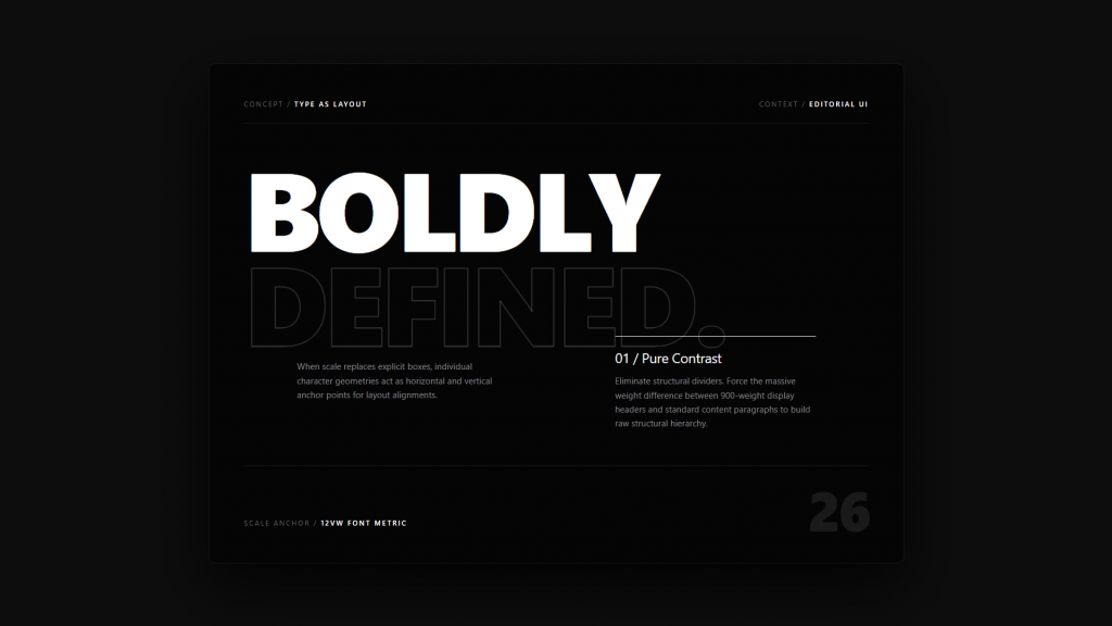
This trend is partly a reaction to image-heavy design: with stock photography saturating the web and AI-generated images becoming increasingly generic, text-based visual identity feels more authentic and distinctive. A brand with a strong typographic voice is harder to replicate than one that relies on stock hero images.
Variable fonts are the technical enabler here. A single font file that supports weight, width, slant, and optical size variations lets designers animate type in ways that were previously only possible with multiple static files — and at a fraction of the performance cost.
Where it works best: Portfolios, agencies, editorial platforms, and brand identity sites. Text-heavy layouts require careful spacing and contrast management to remain readable — don’t let visual ambition sacrifice legibility.
6. Glassmorphism 2.0
Glassmorphism had its first wave in the early 2020s, largely inspired by macOS Big Sur. But the trend faded as implementations became overdone — too much blur, not enough contrast, illegible text. In 2026, it’s back in a more refined form.
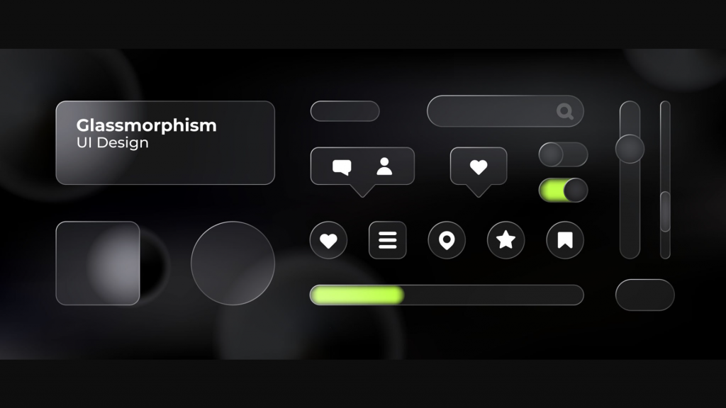
The new glassmorphism is subtler: frosted glass panels used sparingly as overlay states, modal backgrounds, or card treatments rather than applied to the entire UI. It works especially well on dark backgrounds where the blur creates a sense of depth without competing with foreground content.
The effect signals premium, modern, and slightly futuristic — associations that work well for fintech, luxury, SaaS, and creative agencies. Milanche Studio (milanche.com) has applied glassmorphism particularly effectively in digital identity projects for lifestyle and design-forward brands, where the aesthetic aligns naturally with the product positioning.
Implementation tip: Keep background-blur values between 12–20px, ensure a minimum 4.5:1 contrast ratio for text within glass panels, and use sparingly — one or two glass surfaces per screen maximum.
7. Immersive Scrollytelling
Long-scroll pages with story-driven navigation have been around for a while, but 2026’s implementation is far more cinematic. “Scrollytelling” now often includes scroll-triggered 3D model rotations, parallax environmental scenes, chapter-based navigation with progress indicators, and sound design tied to scroll position.
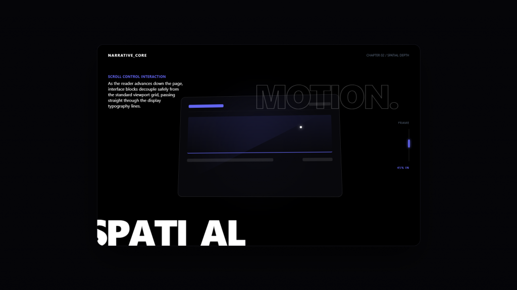
The format is particularly powerful for product launches, annual reports, portfolio case studies, and brand storytelling. When executed well, a scrollytelling experience doesn’t feel like a website — it feels like an interactive film where the user controls the pacing.
The technical stack has matured significantly: Three.js and WebGL make browser-based 3D practical, while tools like Scrollmagic, Lenis, and native CSS scroll-linked animations reduce the custom code overhead considerably.
The caveat: Immersive scroll experiences require significant design and development investment. They also demand rigorous performance optimization — a cinematic page that loads slowly or stutters on mid-range devices destroys the intended effect. Always test on real hardware, not just high-end developer machines.
8. Sustainability-Conscious Design
The carbon cost of digital products has entered mainstream design conversation. In 2026, “sustainable web design” isn’t a niche concept — it’s a genuine differentiator for brands that care about environmental positioning, and a practical framework that often improves performance in the process.
Sustainable design principles include: minimizing unnecessary JavaScript, choosing system fonts over custom-loaded typefaces where possible, compressing and lazy-loading media assets, using green hosting infrastructure, and reducing the number of third-party scripts (trackers, chat widgets, ad pixels) that inflate page weight.
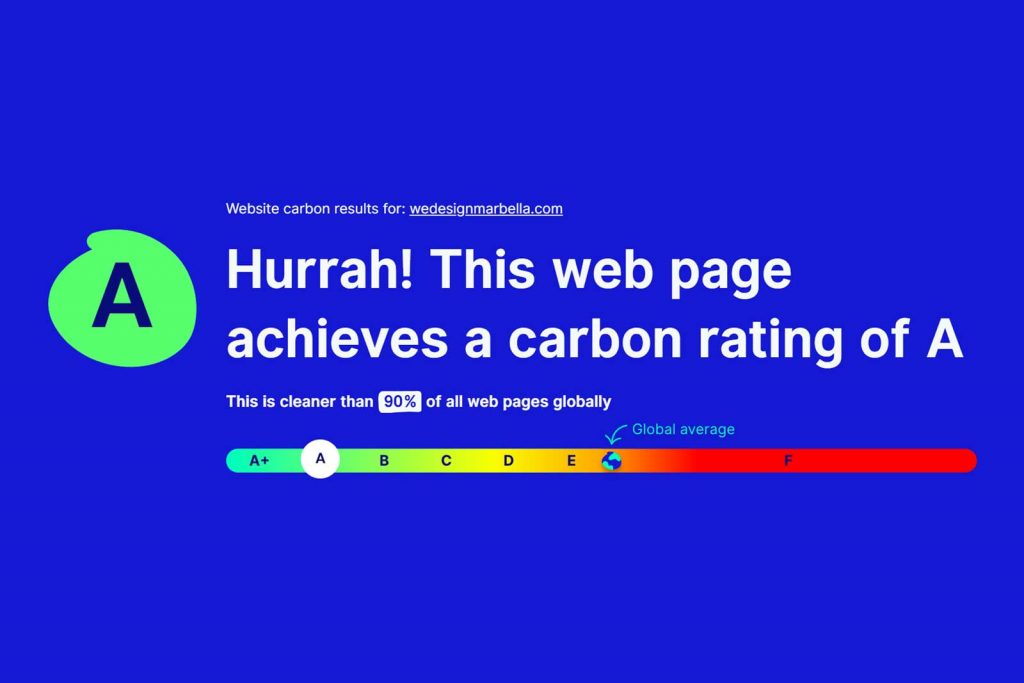
Frameworks like the Website Carbon Calculator allow designers to measure and report on a site’s carbon footprint. Some studios now include a carbon badge in their footers — a small but meaningful signal to environmentally conscious audiences.
The performance bonus: Most sustainable design choices are also performance choices. A leaner, faster website ranks better in search, converts more users on slow mobile connections, and provides a better experience across all devices. Sustainability and business results align here.
9. Inclusive and Accessible Design by Default
Accessibility is no longer treated as a checklist item bolted onto finished designs. In 2026, leading studios integrate inclusive design from the wireframe stage. This means structuring content with semantic HTML, designing focus states that are visually attractive (not just functional), ensuring color contrasts that work for colorblind users, and building interfaces that function fully with keyboard-only navigation.
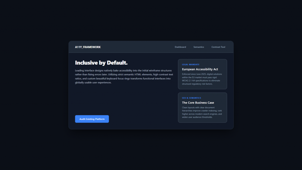
There are also legal pressures accelerating adoption: the European Accessibility Act came into force in June 2025, requiring many digital products sold in the EU to meet WCAG 2.1 AA standards. Non-compliant businesses face regulatory risk, which has focused minds across the industry.
Beyond compliance, there’s a strong business case: accessible websites rank better in search engines (structured semantics are also SEO signals), reach wider audiences including users with temporary disabilities (a broken arm, bright sunlight on a phone screen), and reduce legal exposure.
Where to start: Run your existing site through WAVE or Axe DevTools. Focus first on the highest-impact, lowest-effort fixes: sufficient color contrast, descriptive alt text for images, and logical heading hierarchy.
10. Authentic, Brand-Specific Illustration
The era of generic flat design illustration is winding down. In 2026, brands that use illustration invest in genuinely custom visual languages — character styles, environments, and icon systems that are unmistakably theirs and couldn’t be swapped onto a competitor’s site without looking wrong.
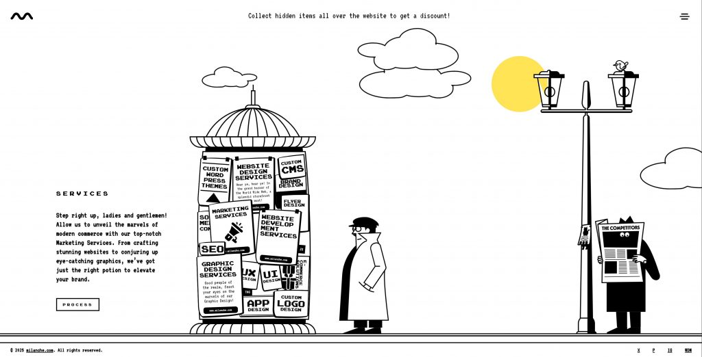
This is partly a reaction to AI image generation. When anyone can produce a photorealistic image in seconds, unique hand-crafted illustration becomes a stronger signal of brand authenticity and investment. A distinctive illustration style is an IP asset — it can’t be easily replicated or commoditized.
The styles in favor this year lean toward textured and imperfect over smooth and polished: risograph aesthetics, grainy gradients, gestural linework, and retro-influenced color palettes that feel warm and human rather than algorithmically optimized.
How These Trends Work Together
The best web design in 2026 doesn’t pick one trend and execute it in isolation. It weaves several together into a coherent system: a dark-first interface with oversized type, subtle glassmorphism for overlays, scroll-triggered motion, and a custom illustration set that defines the brand’s visual voice.
The common thread across all these trends is intentionality. Every design choice should serve the user and the brand story — not chase novelty for its own sake.
If you’re looking for a studio that applies these principles to real-world projects for businesses in Southern Europe and beyond, We Design Marbella produces work that reflects exactly this kind of considered, trend-informed approach. Similarly, Milanche brings a strong editorial and brand identity perspective to digital design that makes it worth studying for creative direction inspiration.
Final Thoughts
Trends are tools, not rules. The goal isn’t to implement every item on this list — it’s to understand the forces shaping user expectations so you can make informed design decisions.
In 2026, the through-line across all of these trends is the same: users want digital experiences that feel crafted, responsive, and human. Bento grids and AI personalization can both serve that goal. So can dark mode and inclusive design. The question is always which combination serves your specific audience and brand best.
Stay curious, test your assumptions, and never stop watching how the web is evolving. The next trend is already loading.
Want to see these trends in action? Explore wedesignmarbella.com for live examples of modern web design applied to real businesses, and milanche.com for brand-forward digital identity work.
