
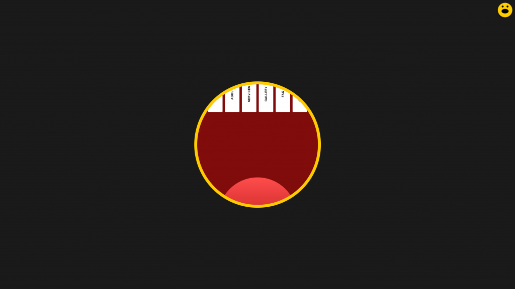
Standard hamburger menus get the job done, but sometimes a project demands a serious dose of personality. If you want to break the mold and give your users an unforgettable digital experience, why not give your website a literal voice?
In this tutorial, we are going to build a “Mouth Menu”. It starts as a subtle, friendly smiley face badge fixed to the corner of the screen. When clicked, it morphs into a giant, stylized open mouth overlay where the links are styled as descending teeth, complete with an animated tongue.
Let’s dive into how to build this piece of UI art using nothing but semantic HTML, modern CSS, and a tiny splash of Vanilla JavaScript.
The Blueprint: HTML Structure
Our markup is split into two distinct parts: the trigger button (the smiley face) and the navigation overlay (the mouth, teeth links, and tongue).
Copy and paste this into your HTML file:
<button class="smiley-trigger" id="smileyBtn" aria-label="Toggle Menu">
  <div class="smiley-face">
    <div class="eyes">
      <div class="eye left"></div>
      <div class="eye right"></div>
    </div>
    <div class="mouth-closed"></div>
  </div>
</button>

<nav class="mouth-menu" id="mouthMenu">
  <div class="teeth-container">
    <div class="teeth-row top-teeth">
      <a href="#" class="tooth-link"><span class="vertical-text">Home</span></a>
      <a href="#" class="tooth-link"><span class="vertical-text">About</span></a>
      <a href="#" class="tooth-link"><span class="vertical-text">Services</span></a>
      <a href="#" class="tooth-link"><span class="vertical-text">Gallery</span></a>
      <a href="#" class="tooth-link"><span class="vertical-text">FAQ</span></a>
      <a href="#" class="tooth-link"><span class="vertical-text">Contact</span></a>
    </div>
  </div>

  <div class="tongue-container"></div>
</nav>
Key Highlights:
- Accessibility First: We used a semantic
<button>for the trigger and included anaria-label="Toggle Menu"so screen readers understand its purpose. - Vertical Text Spans: Wrapping the link text in a
.vertical-textspan allows us to cleanly rotate the typography later using CSS writing modes.
The Magic: CSS Styling & Animations
This is where the anatomy comes to life. We use standard CSS shapes, clever overflow clipping, and cubic-bezier transitions to make the movement feel incredibly fluid and organic.
Add this to your stylesheet:
/* --- Core Variables & Reset --- */
:root {
  --bg-color: #1a1a1a;
  --smiley-color: #ffcc00;
  --mouth-bg: #800c0c;
  --tooth-color: #ffffff;
  --tongue-color: #ff4d4d;
  --tongue-dark: #cc2929;
}

body {
  margin: 0;
  background-color: var(--bg-color);
  font-family: sans-serif;
  overflow-x: hidden;
}

/* --- Smiley Trigger Button --- */
.smiley-trigger {
  position: fixed;
  top: 20px;
  right: 20px;
  width: 60px;
  height: 60px;
  background: var(--smiley-color);
  border: none;
  border-radius: 50%;
  cursor: pointer;
  z-index: 100;
  display: flex;
  align-items: center;
  justify-content: center;
  box-shadow: 0 4px 10px rgba(0,0,0,0.3);
  /* Playful elastic pop effect on hover/active */
  transition: transform 0.5s cubic-bezier(0.175, 0.885, 0.32, 1.275);
}

.smiley-face {
  width: 100%;
  height: 100%;
  position: relative;
  display: flex;
  flex-direction: column;
  align-items: center;
  justify-content: center;
}

.eyes {
  display: flex;
  gap: 12px;
  margin-top: -5px;
}

.eye {
  width: 8px;
  height: 8px;
  background: #000;
  border-radius: 50%;
}

.mouth-closed {
  width: 24px;
  height: 12px;
  border: 3px solid #000;
  border-top: transparent;
  border-radius: 0 0 15px 15px;
  margin-top: 6px;
  transition: all 0.3s ease;
}

/* Trigger Active States */
.smiley-trigger.active {
  transform: scale(1.2);
}

.smiley-trigger.active .mouth-closed {
  height: 16px;
  border-radius: 50%;
  background: #000; /* The little smile opens wide when clicked */
}

/* --- The Giant Mouth Overlay --- */
.mouth-menu {
  position: fixed;
  top: 50%;
  left: 50%;
  transform: translate(-50%, -50%) scale(0);
  width: 80%;
  max-width: 600px;
  aspect-ratio: 1 / 1;
  background: var(--mouth-bg);
  border: 15px solid var(--smiley-color);
  border-radius: 50%;
  z-index: 90;
  opacity: 0;
  visibility: hidden;
  transition: transform 0.6s cubic-bezier(0.77, 0, 0.175, 1), opacity 0.4s ease;
  overflow: hidden; /* Crucial: Keeps the square shapes of the teeth masked into a perfect circle */
  display: flex;
  align-items: flex-start;
  justify-content: center;
}

.mouth-menu.open {
  transform: translate(-50%, -50%) scale(1);
  opacity: 1;
  visibility: visible;
}

/* --- Tooth Drops Mechanics --- */
.teeth-container {
  width: 100%;
  height: 100%;
  padding-top: 5%;
  box-sizing: border-box;
  z-index: 2;
}

.teeth-row {
  display: flex;
  justify-content: center;
  gap: 2%;
  width: 100%;
  height: 45%;
}

.tooth-link {
  background: var(--tooth-color);
  width: 12%;
  height: 70%;
  display: flex;
  align-items: center;
  justify-content: center;
  text-decoration: none;
  color: #000;
  font-weight: bold;
  border-radius: 200px 200px 16px 16px;
  transform: translateY(-40%); /* Partially hides the tooth up into the lip */
  transition: transform 0.4s cubic-bezier(0.25, 0.46, 0.45, 0.94),
              height 0.4s cubic-bezier(0.25, 0.46, 0.45, 0.94);
}

/* The Drop Down Interaction */
.tooth-link:hover {
  height: 100%;
  transform: translateY(0%); /* Drops the tooth fully down on hover */
}

.vertical-text {
  writing-mode: vertical-rl;
  text-transform: uppercase;
  letter-spacing: 1px;
  font-size: 0.9rem;
  white-space: nowrap;
  transform: rotate(180deg);
  transition: transform 0.3s ease;
}

.tooth-link:hover .vertical-text {
  padding-top: 10px;
}

/* --- The Dynamic Tongue --- */
.tongue-container {
  position: absolute;
  bottom: 0;
  left: 50%;
  transform: translateX(-50%) translateY(45%);
  width: 65%;
  height: 35%;
  background: linear-gradient(to top, var(--tongue-dark), var(--tongue-color));
  border-radius: 300px 300px 0 0;
  z-index: 1;
  pointer-events: none; /* Allows hover clicks to pass straight through to teeth links if overlapping */
  transition: transform 0.5s cubic-bezier(0.175, 0.885, 0.32, 1.275);
}

/* Tongue wiggles up into view when the mouth opens */
.mouth-menu.open .tongue-container {
  transform: translateX(-50%) translateY(35%);
}
The Logic: Simple Vanilla JavaScript
To bind it all together, we need to toggle the dynamic open/close classes when the user clicks the smiley button or clicks a navigation link.
const smileyBtn = document.getElementById('smileyBtn');
const mouthMenu = document.getElementById('mouthMenu');

// Toggle menu open/close on button click
smileyBtn.addEventListener('click', () => {
  smileyBtn.classList.toggle('active');
  mouthMenu.classList.toggle('open');
});

// Close the menu automatically when a link is clicked
document.querySelectorAll('.tooth-link').forEach(tooth => {
  tooth.addEventListener('click', () => {
    smileyBtn.classList.remove('active');
    mouthMenu.classList.remove('open');
  });
});
Why This Works So Well
- CSS Clipping Magic: By setting
overflow: hiddenon the circular.mouth-menu, the straight lines of the descending teeth are automatically clipped along a curved arc, creating a perfect dental alignment. - Snappy Micro-interactions: The use of
writing-mode: vertical-rllets the text run downward seamlessly inside each narrow tooth column. - Performance Minded: Every single animation relies strictly on
transformandopacityproperties. This ensures high-performance rendering that maintains a silky smooth 60 FPS even on lower-tier mobile screens.
Have you integrated a highly experimental menu layout into a recent project? Drop your thoughts or link your creations in the comments below!
How to Increase Website Engagement with Interactive Content
Beyond the Bloat: How to Build Ultra-Fast, “No-Template” WordPress Sites for High-End Clients
How to Get More Web Design Clients in Marbella (Step-by-Step Guide)
Beyond the Menu: The 4 Non-Negotiable Features of a High-Converting Restaurant Website
4K Web Design: Designing for the Era of Big Screens
