
Interactive content can increase website engagement by turning passive visitors into active participants. The post explains why calculators, quizzes, configurators, polls, interactive infographics, and case studies keep users on site longer and can improve lead generation and conversion.
It also covers where to place these formats, how to design them for low friction and mobile reliability, and which metrics to track to measure their impact.
Static pages inform. Interactive content engages. Here’s how to use tools, calculators, quizzes, and dynamic experiences to keep visitors on your site longer — and convert more of them.
Introduction
Time on site. Pages per session. Scroll depth. These are the metrics that separate a website people visit from a website people experience. And in 2026, the gap between the two is increasingly filled by interactive content.
Interactive content is any element that requires active participation from the user: a quiz that returns personalized results, a calculator that outputs a custom figure based on user inputs, a configurator that lets a visitor build their ideal product, or a poll that makes them feel like part of a community. Unlike static text or imagery, interactive content turns passive reading into active engagement.
The results are well documented: interactive content generates roughly twice the engagement of static content, keeps users on page significantly longer, and — critically — creates a data exchange. When users interact with your content, they’re telling you who they are, what they want, and what they’re willing to spend. That’s invaluable data, and interactive content collects it naturally.
This article covers the most effective interactive content formats, how to deploy them strategically, and the design and technical principles that make them work.
Why Interactive Content Works
Before diving into specific formats, it’s worth understanding the psychology behind why interactive content is so effective.
Reciprocity: When a calculator or quiz tool gives a user a genuinely useful output — a price estimate, a personalized recommendation, a score — the user feels they’ve received something of value. This creates a sense of reciprocity that makes them more likely to share their email address or contact details in return.
The Zeigarnik Effect: People remember incomplete tasks better than completed ones. A quiz that shows a progress bar (“Question 3 of 7”) creates psychological tension that keeps users moving forward because they’re motivated to close the loop.
Personalization: Generic content addresses nobody in particular. Interactive content that adapts to the user’s inputs creates a personalized output that feels specifically relevant to their situation. Personalized experiences consistently outperform generic ones across every marketing metric.
Active processing: Cognitive science tells us that information processed actively (through doing) is retained far better than information processed passively (through reading). Users who interact with your content are learning more from it — and remembering more about you.
The Most Effective Interactive Content Formats in 2026
1. Calculators and Estimators
Calculators are the highest-converting format of interactive content for service and product businesses, and for good reason: they give users something immediately useful in exchange for their engagement.
For a web design agency, a project cost estimator allows a potential client to select their requirements (type of site, number of pages, required integrations, timeline) and receive a ballpark investment range. This serves multiple functions simultaneously: it educates the prospect about what influences pricing, it qualifies them (someone who balks at the minimum figure is unlikely to convert anyway), and it creates a natural handoff to the next step (“Want an exact quote? Book a call”).
For an e-commerce brand, a “how much will I save?” calculator that lets users input their current costs and compare against the brand’s pricing is a powerful pre-purchase conversion tool.
Key design principle: The output must be genuinely useful. A calculator that returns a vague range (“£2,000–£50,000 depending on your needs”) provides no value and erodes trust. Tighter, more specific outputs — even if caveated — work far better.
Technical implementation: Simple calculators can be built in pure JavaScript with no backend. More complex ones that require pricing data, inventory, or CRM integration may need a lightweight API layer. Tools like Outgrow and Calconic offer no-code calculator builders for non-technical teams.
2. Quizzes and Assessments
Quizzes have proven themselves as one of the most shareable and engaging content formats across almost every industry. The format works because users are intrinsically curious about themselves — a quiz that promises self-knowledge (even about something as mundane as “What type of website does your business need?”) reliably captures attention.
The most effective quizzes in a business context are outcome quizzes that lead to segmented results: different answers trigger different result pages, each with tailored copy and calls to action. A visitor who answers as a solopreneur gets recommendations appropriate to a smaller budget and simpler needs; a visitor who identifies as a scaling SME sees a different set of recommendations and a different CTA. Both paths feel personally relevant.
Where they work best: Lead generation (quiz as the entry point to a drip email sequence), product recommendation (e-commerce and SaaS), content personalization (directing users to the blog post or case study most relevant to their situation), and audience segmentation.
Lead capture placement: The industry standard is to present an optional email capture form at the end of the quiz, before revealing results. Users who have invested 3–5 minutes answering questions are far more likely to share their email than they would have been on a generic pop-up. Conversion rates of 30–50% are common at this touchpoint.
3. Interactive Infographics and Data Visualizations
Static infographics were the default for data-heavy content a decade ago. In 2026, the best data storytelling is interactive: users can filter, sort, hover for detail, and explore the data according to what’s most relevant to them.
An interactive visualization that lets a user select their industry and see relevant benchmarks, or filter a dataset by country or company size, keeps users engaged far longer than a static image — and gives them a more personalized, memorable experience of the underlying data.
For thought leadership content, interactive data visualizations are particularly powerful. They signal analytical depth, are more likely to be cited and linked to by other publications, and provide a reason for users to return (“I want to check the updated data”).
Tools to consider: D3.js for custom implementations, Flourish and Datawrapper for no-code interactive charts, Observable for data-science-leaning audiences.
4. Product Configurators and Builders
For businesses selling customizable products or services, a product configurator is one of the most powerful engagement and conversion tools available. Users select options (color, size, material, features) and see their custom product update in real time — sometimes with a live price update.
The engagement value is enormous: users who build something feel a sense of ownership over the result (the “IKEA effect” — we value things we helped create more than things that were handed to us). That psychological ownership dramatically increases purchase intent.
In web design and digital agency contexts, a service scope builder can serve a similar function: users select the type of project, the pages needed, the integrations required, and the timeline, and see an estimated investment update as they go. This tool type is central to how agencies like We Design Marbella pre-qualify and educate clients before a discovery call — turning a cold prospect into a warm, informed one.
5. Polls, Surveys, and Community Features
Polls and quick surveys are among the simplest forms of interactive content to implement and among the most effective at creating a sense of community and participation.
A poll embedded in a blog post (“Which of these is your biggest website challenge right now?”) takes seconds to answer, but it creates engagement, surfaces audience insights, and shows the user their response in relation to others. That social element is powerful: people are inherently curious about what others in their peer group think.
For brands building community alongside product, polls also serve as low-friction feedback mechanisms. What you learn from 500 poll responses is often more actionable than what you’d get from months of sales calls.
Platform options: Typeform, Tally, and Pollfish for standalone tools; native poll features in CMS platforms like Webflow and WordPress with appropriate plugins.
6. Interactive Case Studies and Portfolio Pieces
This format is underused but highly effective for agencies, consultancies, and creative businesses. Rather than presenting a portfolio piece as a static before/after image with a caption, an interactive case study lets the user explore the project: click between design variants, toggle a live/wireframe view, see the measurable results, and read the strategic rationale.
Milanche, for example, uses rich case study formats to show the depth of thinking behind brand identity and digital design projects — turning what could be a gallery into a genuine learning experience for potential clients.
The effect on conversion is significant: a potential client who has spent five minutes exploring how you solved a problem for a previous client is far warmer than one who glanced at a portfolio thumbnail.
Strategic Placement: Where to Put Interactive Content
The format matters, but placement matters equally. Here’s where interactive content drives the most value across your site:
Homepage: A simple, high-value tool (a cost estimator, a quick quiz) positioned within the first or second scroll depth can dramatically reduce bounce rate and increase time on site. It signals immediately that this is an engaging, useful site — not a static brochure.
Long-form blog posts: Embedding a relevant calculator or poll mid-article keeps users engaged through content they might otherwise skim. A “How to choose a web design agency” post that includes a quiz halfway through (“Answer 5 questions to find the right type of agency for your needs”) serves readers and captures leads simultaneously.
Service or product pages: Configurators and estimators on service pages allow users to self-educate about scope and pricing without requiring a sales conversation, which shortens the consideration phase and produces more qualified enquiries.
Landing pages: A well-placed quiz at the top of a landing page — before a long-form explanation of the service — warms users up, personalizes the pitch, and increases conversion rates compared to purely static landing pages.
Design Principles for Interactive Content
Keep friction low at entry
The first interaction should require almost no effort. A quiz that opens with a complex or ambiguous question loses users immediately. Start with the simplest, most obvious question (“What best describes your business?”) and save nuanced questions for later when the user is invested.
Show progress
For multi-step interactions (quizzes, configurators), always show a progress indicator. The Zeigarnik Effect means users are motivated to finish what they’ve started — but only if they can see how much they’ve started.
Deliver value before asking for anything
The most common mistake with interactive content is requesting an email address before delivering any output. Ask after the user has engaged, invested time, and received at least partial value. Your conversion rate will be significantly higher.
Make sharing easy
The most shareable interactive content gives users a result they want to share: “I got 8/10 on the web design knowledge quiz!” or “My personalized website score is 62 — here’s what I need to fix.” Include native sharing buttons for your most shareable content, and design results pages to look attractive when shared as screenshots on social media.
Test on real mobile devices
Interactive content is particularly vulnerable to mobile rendering issues. A JavaScript-heavy calculator that works perfectly on desktop may be slow, broken, or frustrating on a mid-range Android phone. Test every interactive element on real devices, not just browser developer tools.
Measuring the Impact of Interactive Content
Once you’ve launched interactive content, you need to measure whether it’s doing its job. The key metrics to track:
Engagement rate: What percentage of users who see the interactive element interact with it? If fewer than 20% of homepage visitors use your estimator, consider whether it’s positioned correctly or whether the entry question is compelling enough.
Completion rate: For multi-step interactions, what percentage of users who start complete all steps? A significant drop at a specific question indicates a friction point worth fixing.
Lead capture rate: For tools with email capture, what percentage of completing users provide their email? Below 20% suggests the value exchange isn’t compelling enough; above 40% is excellent.
Conversion rate impact: Compare the conversion rate of users who engaged with interactive content against those who didn’t. This downstream metric is the truest measure of business impact.
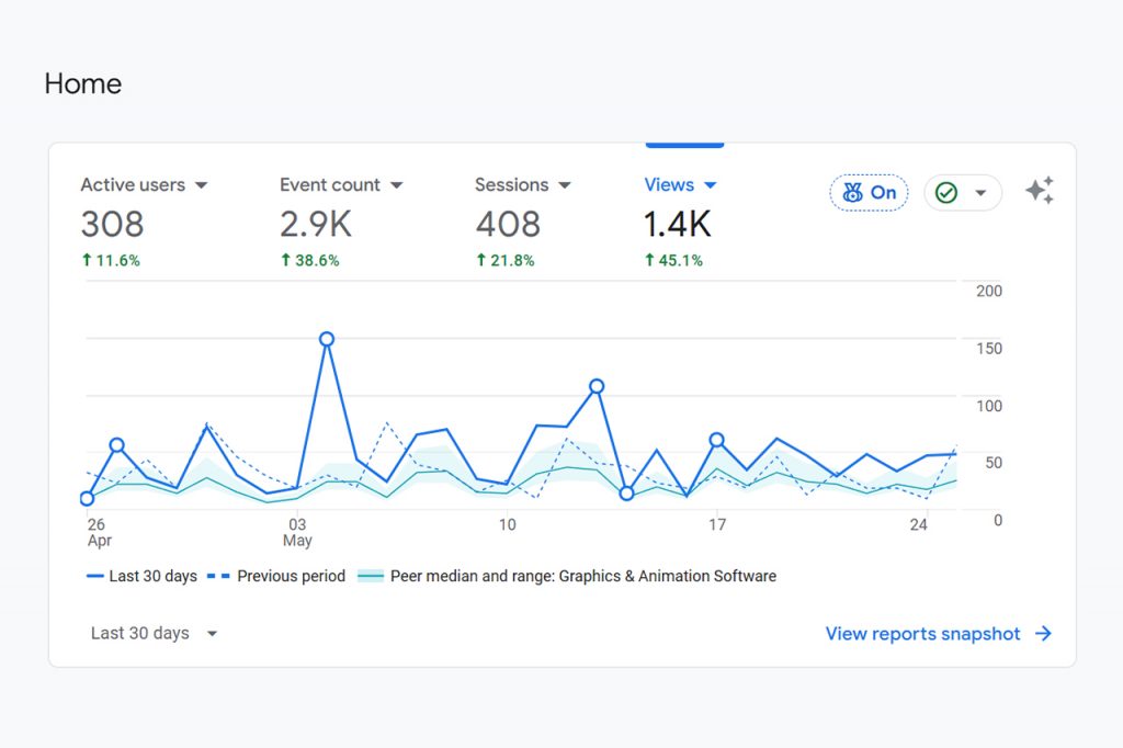
Track these through a combination of Google Analytics 4 event tracking, your CRM (to track leads generated through interactive tools), and heat mapping software that can capture click events on interactive elements.
Conclusion
Interactive content is one of the highest-leverage investments you can make in your website experience. It transforms passive audiences into active participants, generates qualified leads through value-first exchanges, and creates the kind of memorable, personalized experiences that turn visitors into clients.
The best interactive content doesn’t feel like marketing — it feels genuinely useful. A calculator that saves a prospect 30 minutes of emailing back and forth for a quote is valuable on its own terms. That value is what creates trust, and trust is what creates conversion.
Start with one format that aligns with your audience’s most common question: if they always want to know “what will this cost?”, build an estimator. If they want to know “what do I need?”, build a quiz. Then measure, refine, and expand from there.
If you want to see how interactive elements can be integrated into a professionally designed website, We Design Marbella builds engagement-optimized sites for businesses across Spain and beyond. For brand and digital experience inspiration, Milanche is worth exploring.
What type of interactive content would work best for your business? Start there, and build from what you learn.
Beyond the Bloat: How to Build Ultra-Fast, “No-Template” WordPress Sites for High-End Clients
How to Get More Web Design Clients in Marbella (Step-by-Step Guide)
Beyond the Menu: The 4 Non-Negotiable Features of a High-Converting Restaurant Website
4K Web Design: Designing for the Era of Big Screens
Responsive Masonry Gallery: CSS Grid Layout #1
