
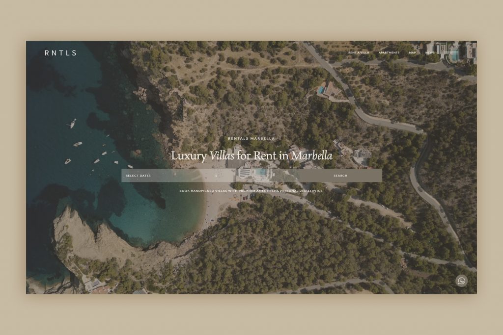
The post outlines a strategy for building a homepage that converts visitors into leads, subscribers, or buyers in 2026. It emphasizes a single primary goal, clear hero messaging, strong social proof, a simple process section, FAQ-based objection handling, and a final call to action.
It also covers copywriting, visual hierarchy, mobile-first design, page speed, and ongoing testing. The article ends with a checklist for auditing or rebuilding a homepage and frames the homepage as a living asset that should be optimized over time.
Your homepage has one job: turn curious visitors into engaged prospects. Here’s the complete, strategic playbook for making that happen in 2026.
Introduction
Your homepage is the most important page on your website — and also the most misunderstood one.
Most businesses treat it as a brochure: a place to list services, display a logo, and include a phone number. But a high-converting homepage in 2026 is something closer to a finely tuned sales conversation. It anticipates questions. It builds trust systematically. It removes friction at every step. And it guides the right visitors — those who are genuinely likely to become customers — toward a clear next action.
The stakes have never been higher. Average bounce rates hover around 50–70% depending on the industry, which means more than half of the people who visit your homepage leave without taking any action at all. A well-designed, strategically structured homepage can cut that figure significantly and dramatically increase the proportion of visitors who convert into leads, subscribers, or buyers.
This guide covers everything: structure, copywriting principles, visual design decisions, performance, trust signals, and the specific tactics that are producing results in 2026. By the end, you’ll have a clear framework to audit your current homepage or build a new one that genuinely converts.
Part 1: Understanding What “Conversion” Actually Means for Your Homepage
Before diving into tactics, you need to be precise about what you want your homepage to do.
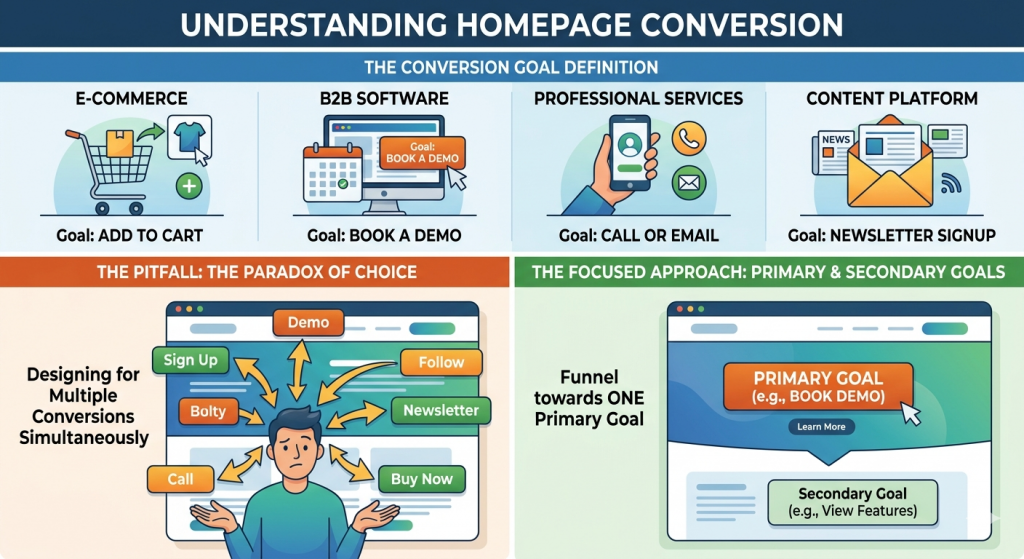
Not all conversions are equal. For an e-commerce brand, conversion might mean adding a product to cart. For a B2B software company, it might mean booking a demo. For a professional services firm, it might mean calling or emailing. For a content platform, it might mean signing up to a newsletter.
The mistake many businesses make is designing for multiple conversions simultaneously — cluttering the page with newsletter forms, demo CTAs, social media follows, and contact buttons all at once. This creates what psychologists call the paradox of choice: when everything competes for attention, nothing wins.
Your homepage should have one primary conversion goal and, at most, one secondary goal. Everything — layout, copy, visual hierarchy, calls to action — should funnel toward those goals.
Once you’ve defined your primary conversion, you can work backwards from it to design every element of the page.
Part 2: The Anatomy of a High-Converting Homepage
Section 1: The Hero — Your Most Critical Real Estate
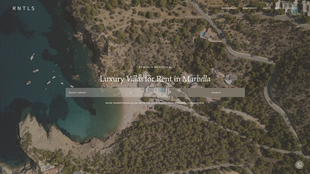
The hero section (what users see before scrolling) is the single most important part of your homepage. Research consistently shows that users decide within 50 milliseconds whether a site is worth their time. The hero either validates their decision to stay or triggers the back button.
A high-converting hero in 2026 needs five elements:
1. A clear, specific headline Your headline should answer one question immediately: What is this, and why should I care? Avoid clever abstractions and lead with the specific outcome or benefit you deliver. “Premium web design for businesses in Southern Spain” outperforms “We craft digital experiences” every time — the former speaks to a specific person with a specific need.
2. A supporting subheadline One or two sentences that expand on the headline, address the reader’s primary concern, and add credibility. This is where you can mention your process, your differentiator, or a specific proof point.
3. A primary CTA button One button. Action-oriented copy (not “Submit” — try “Get a Free Quote,” “See Our Work,” or “Start Your Project”). High contrast color. Positioned above the fold without requiring any scrolling.
4. A visual that communicates instantly This can be a screenshot of your product, a photograph that shows the outcome of your service, a short autoplay video, or a 3D render. The image should reinforce the headline — not contradict it. If your headline promises “luxury web design,” a generic Unsplash photo of a laptop undermines the claim immediately.
5. Social proof (condensed) A small cluster of trust signals: a row of client logos, a star rating with a count (“Rated 4.9/5 by 200+ clients”), or a one-line testimonial. Placing this directly in the hero section — not buried lower down the page — dramatically increases perceived credibility before the user has invested any time.
Section 2: The Problem/Solution Bridge
After the hero, many websites jump directly into features or services. This is a mistake. The user hasn’t yet felt understood — they haven’t had the experience of thinking “these people get exactly what I’m dealing with.”
The problem/solution bridge is a short section (often 2–3 sentences or a compact two-column layout) that names the pain the user is experiencing and positions your offering as the specific resolution.
For a web design agency, this might look like:
Most businesses invest in a beautiful website and get almost no results from it. That’s because design without strategy is decoration. We combine conversion-focused architecture with distinctive visual design to build sites that look exceptional and actually grow your business.
This section doesn’t need to be long. It needs to be accurate. If a visitor reads it and thinks “that’s exactly my situation,” you’ve done the job.
Section 3: Services or Features — Clarity Over Completeness
This is where most businesses over-communicate. They list every service, every feature, every nuance of what they offer — because from the inside, every detail feels important.
The user doesn’t want completeness. They want enough to know whether you can solve their problem.
Keep this section to three to five core offerings or features. For each one, lead with the benefit (what the customer gets), not the feature name (what you do). Include a short description and, where possible, a visual or icon that aids scanning.
Consider the difference:
- ❌ CustomWebsite Development — We use modern frameworks to build responsive websites.
- ✅ A website that works as hard as you do — Custom-built, fast-loading, and designed to turn visitors into enquiries — without you needing to touch the code.
The second version is longer, but it’s selling an outcome, not a technical process.
Section 4: Social Proof — The Engine of Conversion
No element increases conversion more reliably than social proof. In 2026, users have become extremely skeptical of marketing claims — but they still trust other customers. Social proof is the mechanism that converts skepticism into belief.
The most effective social proof elements, ranked by impact:
Video testimonials consistently outperform text. A 60-second clip of a real customer describing a real result (with a name, face, and company visible) is worth ten written reviews. Even a selfie-style phone recording performs well — authenticity matters more than production quality.
Case studies with measurable outcomes (“redesigned their homepage and increased inquiries by 140% in 3 months”) are powerful for B2B services. Include before/after context, the challenge, the approach, and the result. Link to full case studies from the homepage.
Client logos work as visual shorthand — they communicate “others you’ve heard of trust this company.” Logos from recognizable brands in your client’s industry are particularly effective. Even logos of smaller clients carry weight if they’re from companies the visitor can verify independently.
Star ratings and review counts, especially when sourced from third-party platforms (Google, Trustpilot, Clutch), carry more weight than internal testimonials. Display the platform source and link to the original reviews where possible.
The social proof section on your homepage should not be a single carousel. It should be layered throughout the page — a logo strip in the hero, a testimonial quote below the services section, a full case study block mid-page, and a review cluster above the footer CTA.
Section 5: The Process Section — Removing Fear of Commitment
One of the most overlooked causes of low conversion is uncertainty about what happens after someone clicks the button. Users don’t just worry about whether your product or service is right — they worry about what the experience of buying or engaging will involve. Will it be complicated? Will they be pressured? Will they lose control of the timeline or budget?
A simple, three-to-four-step process section answers these questions before they’re asked:
- We have a free 30-minute discovery call
- We send you a detailed proposal within 48 hours
- You approve the plan and we begin within one week
- We deliver your site and support the launch
This section signals professionalism, removes ambiguity, and makes the primary CTA feel much less risky. Clicking “Book a Call” becomes dramatically easier when the user already knows exactly what that call involves and what happens next.
Section 6: The FAQ — Objection Handling at Scale
Every potential customer has the same set of questions. They’re just afraid to ask them. The FAQ section of your homepage is where you proactively surface and address objections so that no purchase gets blocked by an unanswered concern.
Common objections for service businesses include:
- How long does this take?
- How much does it cost?
- What do I need to provide?
- Can I see examples of your previous work?
- What if I’m not happy with the result?
- Do you work with businesses in my industry/country?
Answer each one honestly and specifically. Vague answers (“it depends on the scope”) erode trust just as much as leaving the question unanswered. If pricing genuinely varies, give a range or a starting price and explain the factors that influence it.
The FAQ section also has a significant SEO benefit: it naturally includes the question-and-answer structure that search engines use for featured snippets.
Section 7: The Final CTA — Close with Clarity
The bottom of your homepage is where interested users have arrived after reading everything. They’re warm. They need one more nudge.
The closing CTA section should:
- Restate the core value proposition in a single line
- Include your primary CTA button (matching the one in the hero)
- Optionally include a secondary softer option (“Not ready yet? Browse our portfolio”)
- Add one final piece of social proof — a single powerful testimonial or a trust badge
Avoid adding new information here. The user should feel they’re being invited to take action, not introduced to more content they need to process.
Part 3: Copywriting Principles That Drive Action
Design gets users to read. Copy gets users to act.
Write for one person. Your homepage isn’t read by a market segment — it’s read by an individual who has a specific problem, a specific budget, and a specific fear. Write as if you’re sitting across from that person. Use “you” far more than “we.”
Lead with outcomes, not features. Users don’t buy web design — they buy more customers, more credibility, more time saved, more revenue. Every benefit you describe should be articulated in terms of what the user’s life looks like after they’ve worked with you.
Use concrete specificity. “We’ve helped over 60 businesses” is more believable than “we help many businesses.” “Your site will load in under 2 seconds” is more compelling than “your site will be fast.” Numbers, names, and specific details build credibility in a way that adjectives never can.
Keep sentences short. Especially on screen. Long sentences increase cognitive load and reduce the probability that users will read to the end. Aim for an average sentence length of 15–18 words in body copy, shorter in headlines.
Write CTAs in first-person. Research shows that CTAs phrased in first person consistently outperform second-person alternatives. “Start My Free Trial” outperforms “Start Your Free Trial.” The user is mentally stepping into the action, and first-person reinforces that.
Part 4: Visual Design Decisions That Affect Conversion
Hierarchy and White Space
Every element on your page is either primary, secondary, or tertiary in importance.
Your visual design should make that hierarchy obvious: the primary element (headline, CTA) is largest, boldest, and most visually prominent. Secondary elements (sub-copy, supporting images) are clearly subordinate. Tertiary elements (navigation links, footer text) recede visually.
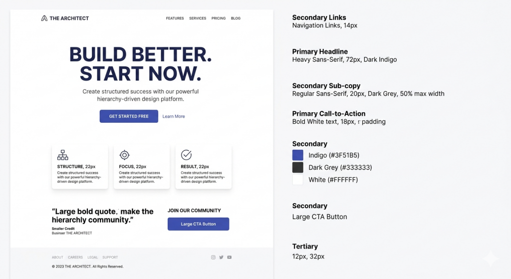
White space — empty space around elements — is not wasted space. It’s attention management. Elements surrounded by white space receive more visual focus than elements crowded by neighbors. Use generous padding around your primary CTA buttons, headlines, and hero sections.
Color Psychology and Contrast
Your CTA button color should contrast sharply with the background — not just in hue but in luminosity. Orange on white, green on dark navy, white on deep purple: these combinations are high-contrast and attention-commanding. Avoid low-contrast combinations (light gray on white, pale blue on pale backgrounds) for any interactive element.
Color Psychology & Contrast
A limited palette eliminates visual noise, while high luminosity contrast ensures your critical actions grab immediate attention.
Primary Brand
#4B0082 (Deep Purple)
Establishes trust, structure, and supporting UI identity.
CTA Accent
#FF8C00 (Bright Orange)
High luminosity leap against dark or light backdrops for pure action.
Neutrals
#333333 & #FFFFFF
Grounds layout and copy cleanly without competing for attention.
Isolated by negative space. Built for maximum conversion.
Get Started FreeYour overall color palette should be limited: one primary brand color, one accent color for CTAs, and neutrals. More colors don’t add richness — they add visual noise that makes the experience feel chaotic and untrustworthy.
Typography and Readability
Body copy should be a minimum 16px on desktop, 18px preferred. Line height for body text should be between 1.5 and 1.7. Line length (measure) should be between 60 and 80 characters — shorter lines are harder to read, longer lines cause reader fatigue.
Heading fonts can break these rules — they’re meant to attract, not sustain reading. But as text size decreases, adherence to readability standards becomes critical for conversion.
Optimized Reading Column (65 Characters Max)
This specific container enforces a structured horizontal width limit. By constraining the layout, your user’s eyes don’t have to scan too far across the viewport to find the start of the next sentence, preventing tracking fatigue over long blog posts.
As the viewport gets smaller or font size scales down, sticking strictly to these proportions ensures content layout conversions remain stable. Good spacing maintains reading flow and reduces bounce rates organically.
Why line lengths matter:
If line lengths run standard full-bleed desktop widths (1200px+), readers lose track of rows when scanning left-to-right. Conversely, narrow columns break compound phrases unnaturally, ruining the reading pattern.
Part 5: Performance — The Conversion Factor You’re Probably Ignoring
A well-designed, perfectly copywritten homepage is worthless if it loads slowly. In 2026, the data is unambiguous:
- A one-second delay in page load reduces conversions by approximately 7%
- 53% of mobile users abandon a page that takes more than 3 seconds to load
- Google’s Core Web Vitals directly influence search rankings, meaning slow pages get less traffic before a single user even arrives
Performance optimization for homepage conversion means: compressing and next-gen-formatting all images (WebP or AVIF), loading fonts efficiently or using system fonts, deferring non-critical JavaScript, minimizing render-blocking resources, and using a CDN for static asset delivery.
Target: Largest Contentful Paint (LCP) under 2.5 seconds. Cumulative Layout Shift (CLS) under 0.1. First Input Delay (FID) under 100ms.
Agencies that understand both the design and performance dimensions of a homepage — like We Design Marbella, which builds performance-optimized sites for service businesses across Southern Spain — consistently produce better conversion results because they treat speed as a design variable, not an afterthought.
Part 6: Mobile-First Is Not Optional
In 2026, the majority of web traffic across virtually every industry category is mobile. “Mobile-first” design isn’t a trend — it’s table stakes.
Mobile homepage design has its own specific requirements:
Touch targets must be large enough. Buttons and interactive elements should be at least 44×44px to be easily tappable. Navigation links spaced too closely together cause accidental taps and frustrate users.
Hero sections need to be concise. What works as a four-line headline on desktop becomes visually overwhelming on a 390px-wide phone screen. Design your hero for mobile first, then expand for desktop — not the other way around.
CTAs must be visible without scrolling. On mobile, “above the fold” is roughly the top 700px of a 390px-wide screen. Your CTA button should appear within this zone.
Images must be sized and served appropriately. Use srcset to serve different image sizes to different screen widths. A 1920px hero image served to a 390px phone screen wastes bandwidth, delays loading, and offers zero visual benefit.
Part 7: Testing and Iteration — The Highest ROI Activity on Your Homepage
A homepage launch is not the end of the process — it’s the beginning. The highest-converting homepages in 2026 are the result of months or years of systematic testing and iteration.
A/B testing allows you to compare two versions of a specific element (headline, CTA copy, hero image, form layout) with real users to determine which produces more conversions. Even small changes can have large effects: changing CTA copy from “Get Started” to “See Pricing” has been shown to increase conversions by 20–30% for certain audiences.
Heatmap and session recording tools (Hotjar, Microsoft Clarity, FullStory) show you exactly where users click, scroll, and abandon. This qualitative data is invaluable for identifying friction points that analytics data alone can’t explain.
User testing — watching real users navigate your homepage and narrate their thought process — surfaces assumptions you didn’t know you were making. “I wasn’t sure if you worked with companies in my country” or “I couldn’t find the pricing” are the kinds of insights that take five minutes of observation to discover and months to stumble upon through data alone.
Build a testing calendar: one test running at all times, results reviewed monthly, winners implemented, new tests launched. Over the course of a year, this systematic approach compounds into conversion gains that no single redesign could achieve.
Putting It All Together: The 2026 Homepage Checklist
Use this as an audit tool for your current homepage or a build guide for a new one:
Hero Section
- Clear, specific, benefit-led headline
- Supporting subheadline with differentiator or proof
- Single, high-contrast primary CTA
- Visual that reinforces the headline
- Condensed social proof (logos, rating, or testimonial)
Problem/Solution Bridge
- Articulates the visitor’s pain point accurately
- Positions the offering as the specific solution
Services/Features
- Limited to 3–5 core offerings
- Each described in terms of outcome, not feature name
Social Proof
- Layered throughout the page (not just one section)
- Includes at least one video testimonial or case study
- Third-party verified ratings visible
Process
- 3–4 step simple process outlined
- Written from the customer’s perspective
FAQ
- Addresses the 5–8 most common objections
- Answers are specific, not vague
Final CTA
- Mirrors hero CTA copy
- Accompanied by one final proof element
Technical
- LCP under 2.5 seconds
- CLS under 0.1
- Mobile-optimized layout and touch targets
- All images compressed and appropriately sized
Conclusion
A high-converting homepage isn’t built in a day, and it isn’t the product of aesthetic taste alone. It’s the result of strategic structure, user-focused copywriting, thoughtful visual hierarchy, rigorous performance optimization, and ongoing testing.
The businesses winning online in 2026 treat their homepage as a living asset — not a set-and-forget brochure. They understand that every element either earns its place by moving a user toward conversion or creates friction that costs them one.
If you’re ready to build or rebuild your homepage with this level of strategic intent, We Design Marbella specializes in exactly this approach for businesses in Spain and internationally. And if you’re looking for design inspiration before making decisions, Milanche is a strong reference point for brands that balance aesthetic excellence with functional performance.
The homepage you have today was built with what you knew then. Build the next one with what you know now.
Enjoyed this article? Share it with a founder or marketer who’s been putting off a homepage redesign — it might be the push they need.
Building a Creative “Mouth Menu” Navigation with CSS & JavaScript
How to Increase Website Engagement with Interactive Content
Beyond the Bloat: How to Build Ultra-Fast, “No-Template” WordPress Sites for High-End Clients
How to Get More Web Design Clients in Marbella (Step-by-Step Guide)
Beyond the Menu: The 4 Non-Negotiable Features of a High-Converting Restaurant Website
