CSS Grid and Flexbox are two of the most powerful layout tools in CSS, each designed to solve different layout challenges. Understanding the strengths and ideal use cases of each will help you create more efficient and effective web designs. In this post, we’ll break down both layout systems, compare their advantages, and help you decide which one to use (and when!).
CSS Flexbox (Flexible Box Layout)
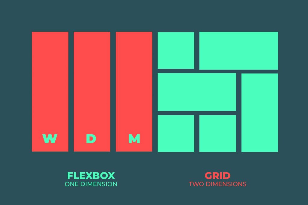
Purpose: Flexbox is designed primarily for one-dimensional layouts, which means it’s perfect for arranging elements either in a row or a column. It provides tools to align, distribute, and control the spacing between elements along a single axis.
Use Cases:
- Navigation bars: Flexbox is perfect for aligning navigation links horizontally or vertically.
- Centering items: Need to center an image or text within a container? Flexbox makes it a breeze.
- Simple layouts: If you just need a layout with items stacked in a row or column, Flexbox is ideal.
- Distributing space evenly: Flexbox allows you to distribute space evenly or with specific proportions.
Key Strengths:
- Simple and intuitive for one-dimensional layouts (row or column).
- Flexible alignment and distribution of elements with ease.
- Responsive design is straightforward because Flexbox automatically adjusts to different screen sizes.
- Supports both vertical and horizontal alignment within a container.
CSS Grid Layout
Purpose: Grid is designed for two-dimensional layouts. It allows you to arrange elements into both rows and columns simultaneously, giving you precise control over placement, alignment, and spacing. This makes it an excellent choice for complex layouts.
Use Cases:
- Complex page layouts: Grid shines when you need to create intricate layouts with multiple sections like headers, footers, sidebars, and main content areas.
- Image galleries: Grid makes it easy to create responsive, grid-based image galleries where items need to be placed in specific positions.
- Form layouts: Need multiple rows and columns for a form? Grid allows for exact control over form field placement.
- Dashboard designs: For layouts that involve multiple, independent sections or items with different sizes, Grid can create organized, predictable structures.
Key Strengths:
- Powerful for two-dimensional layouts: You can control both rows and columns, giving you fine-grained control over placement.
- Precise control over item placement and sizing, down to the pixel or fraction of the container’s size.
- Highly complex layouts can be created effortlessly, making it ideal for more intricate designs.
When to Use Which:
Use Flexbox when:
- You need to arrange items in a single row or column.
- You want to align items or distribute space along one axis (either horizontally or vertically).
- You require a simple layout that doesn’t involve complex rows and columns.
- You’re building a responsive design where the layout should adjust automatically to the screen size.
Use Grid when:
- You need to arrange elements in a two-dimensional grid (both rows and columns).
- You want precise control over item placement, alignment, and sizing.
- You’re creating a complex layout with multiple sections, like website layouts with headers, footers, and sidebars.
- You need to build something that requires more control and flexibility with how content spans and aligns within a grid (e.g., dashboards, magazine-style layouts, etc.).
Combining Flexbox and Grid:
Sometimes, it’s beneficial to combine Flexbox and Grid in the same project. For example:
- You can use Grid to create the overall page layout (like the structure for a main content area, sidebar, and footer).
- Then, use Flexbox inside specific grid areas to align and distribute content more easily (like aligning items within a sidebar or creating a centered navigation bar).
This allows you to leverage the strengths of both tools in a single layout, optimizing your workflow and making it easier to design complex, responsive layouts.
In Summary:
- Flexbox is fantastic for linear layouts (one-dimensional), where elements are arranged in a row or column and you want to control spacing and alignment.
- Grid is best suited for complex, two-dimensional layouts, giving you precise control over both rows and columns.
- Combining both techniques allows you to create flexible, powerful, and responsive designs that fit the needs of any project.
So, when you’re deciding which to use, ask yourself: Do I need a simple, flexible layout (Flexbox), or do I need something more complex with precise row and column control (Grid)? With this guide, you’ll be able to make the best choice for your next design project!
What’s your experience with CSS Grid and Flexbox? Do you have a preference for one over the other, or do you use them in combination often?
HTML (Hypertext Markup Language): The Foundation of the Web
How to Create a High-Converting Website Homepage in 2026
Building a Creative “Mouth Menu” Navigation with CSS & JavaScript
