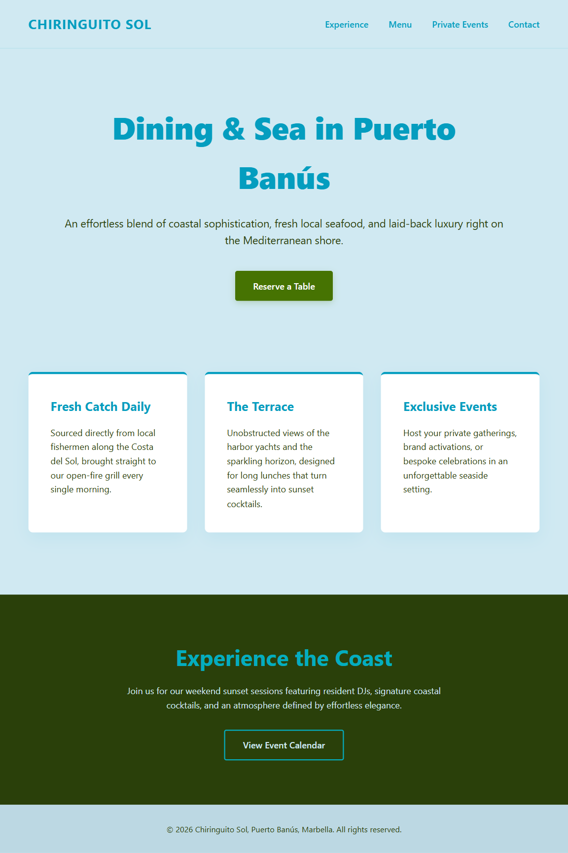
Summer in Puerto Banús
Harbour Teal leads
The deepest blue in frame — pull it for headers, links, or anywhere the palette needs a confident anchor.
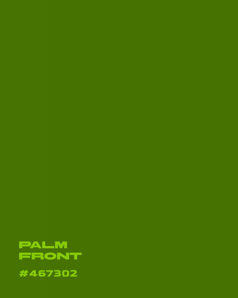
Palm Front grounds it
A working olive green, not a mint or sage — use it where the blues need warmth or contrast, like buttons or icons.
Morning Haze as base
Nearly white but never flat — a good background tint that keeps the teals from feeling cold on a full page.
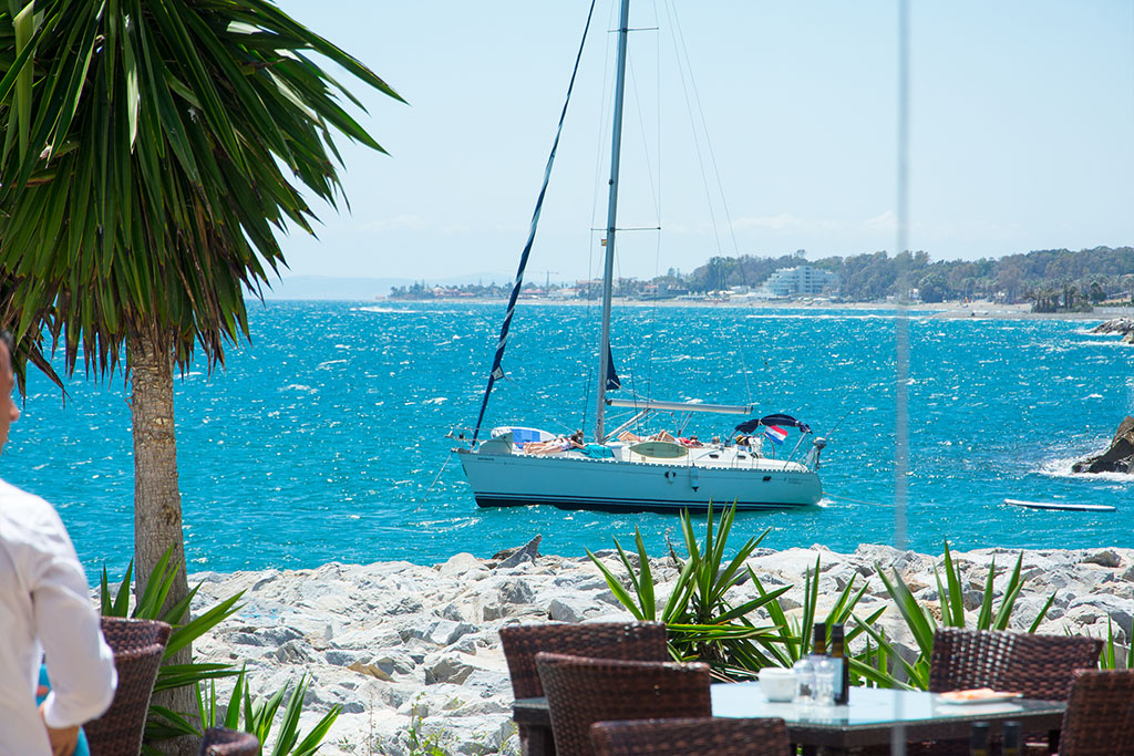
Every colour palette we publish starts the same way: not at a screen, but somewhere on the Costa del Sol. This one came from a dockside table in Puerto Banús, looking out past a palm tree and a moored sailboat — the kind of view that’s easy to take for granted when you live here, and easy to see the value of once you try to put it into a brand.
Five colours came out of that afternoon. Here’s what they are, and where they earn their place on a website.
The palette
Morning Haze #D0E9F2 — a sky so pale it’s almost white, but never flat. This is your background tint, not your accent. It’s the colour that keeps a page feeling like the Mediterranean instead of a generic tech startup.
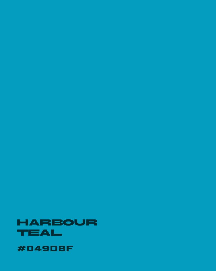
Harbour Teal #049DBF — the deepest blue in the frame, and the one that should lead. Use it for headers, links, and anywhere the design needs a confident anchor. It reads as trustworthy without tipping into corporate.
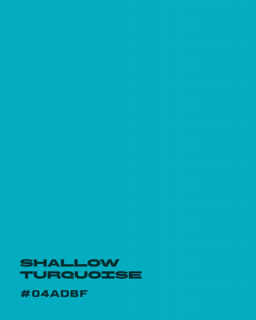
Shallow Turquoise #04ADBF — a lighter, brighter cousin of Harbour Teal. Good for hover states, secondary buttons, or breaking up two blocks of the deeper blue so the page doesn’t go flat.
Palm Front #467302 — a working olive green, not a mint or a sage. This is where the palette gets its warmth. It’s the colour that keeps five shades of blue-green from feeling cold across a full page, and it does real work on buttons, icons, and call-to-action states.
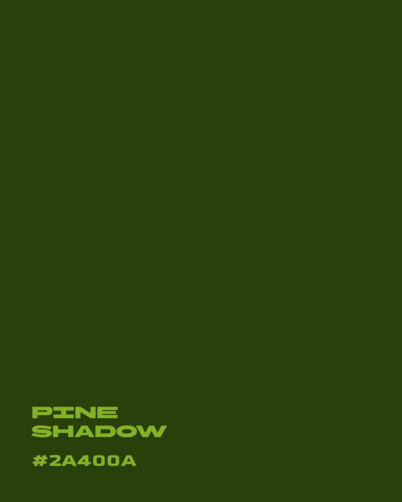
Pine Shadow #2A400A — the deepest tone in the set, reserved for body text on light backgrounds or for a dramatic dark-mode section. Used sparingly, it gives the palette weight without needing black.
CSS Custom Properties (ready to paste)
:root {
  --color-morning-haze:   #D0E9F2; /* background tint */
  --color-harbour-teal:   #049DBF; /* primary brand / headers / links */
  --color-shallow-turq:   #04ADBF; /* hovers, secondary UI */
  --color-palm-front:     #467302; /* warm accent, buttons, icons */
  --color-pine-shadow:    #2A400A; /* body text, dark sections */
}
Usage examples:
body {
  background: var(--color-morning-haze);
  color: var(--color-pine-shadow);
}

a, .btn-primary {
  color: var(--color-harbour-teal);
}

.btn-primary {
  background: var(--color-harbour-teal);
  color: #fff;
}

.btn-secondary {
  background: var(--color-palm-front);
  color: #fff;
}

.tag, .badge {
  background: var(--color-shallow-turq);
  color: #fff;
}
JSON Design Tokens (optional)
If you’re using a design system or framework:
{
  "color": {
    "morningHaze": "#D0E9F2",
    "harbourTeal": "#049DBF",
    "shallowTurquoise": "#04ADBF",
    "palmFront": "#467302",
    "pineShadow": "#2A400A"
  }
}
Why this matters for a Marbella brand
Most luxury real estate and hospitality sites on the Costa del Sol reach for the same shortcut: navy, gold, and a stock photo of a infinity pool. It photographs well, but it doesn’t say anything specific about this coast — it could be Dubai, Miami, or anywhere else with money and a marina.
A palette pulled from an actual afternoon in Puerto Banús does something a stock template can’t: it ties the brand to a real place. Harbour Teal is the colour of the water at that particular dock, not a Pantone chip chosen for “coastal vibes.” That distinction matters more than it sounds like it should — it’s the difference between a site that looks premium and a site that looks like it belongs to the address on the contact page.
For our clients in real estate, vacation rentals, and boutique hospitality, that’s the whole pitch: a five-second glance at the homepage should tell a visitor they’re looking at Marbella, not a template that could be repainted for any coastline in the world.
How to use it on your own site
If you’re building or refreshing a website and this palette fits your brand, here’s the practical breakdown:
- Backgrounds & whitespace: Morning Haze, at low opacity if needed, instead of pure white.
- Primary actions: Harbour Teal for main buttons, nav links, and headline accents.
- Secondary states: Shallow Turquoise for hovers, tags, or supporting UI.
- Warmth & contrast: Palm Front wherever the blues need a counterpoint — icons, badges, secondary buttons.
- Body copy & depth: Pine Shadow for text, footers, or a dark section break.
Keep the ratio roughly the same as the source photograph: mostly sky and water, with green as an accent rather than a co-lead. That’s what keeps the palette feeling like a coastline instead of a golf course.
Try it yourself
We’ve built this palette as an interactive tool above — click any swatch to copy its hex code, or grab the whole set as CSS custom properties with one click. It’s the same system we use when we’re scoping colour direction for a new client project, before a single line of a website gets built.
If you’re working on a brand for the Marbella, Puerto Banús, or San Pedro market and want a palette — and a website — built the same way, get in touch and we’ll walk you through it.
Part of our ongoing colour palette series, each one drawn from a real photograph taken along the Costa del Sol.