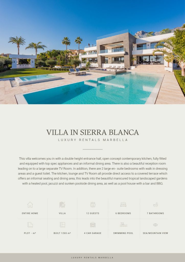
Real Estate Brochure Designs
An effective real estate property brochure is centered on educating the readers first. Content must be your top priority. Yet this shouldn’t be your only focus. Your real estate brochure design will also be one of your main selling points.
A well-designed real estate brochure will convey your content even more persuasively. To help you design your real estate brochure, here are some quick and easy-to-follow design tips and best practices:
1. Choose the Perfect Layout for Your Real Estate Brochure
Visualize how you want your brochure to appear. To do this, list all the contents you need. Include images, headlines, copy, and logo placements. You need to see which type of brochure layouts will work for your content.

Choose from a variety of brochure layouts like bi-fold, trifold, z-fold, four-panel accordion fold, and so on. Trifold is one of the most widely used layouts for real estate brochures. They fit in standard envelopes.
2. Don’t Clutter Your Brochure
There’s a lot of information that you want to relay to your audience. So the tendency is to include too many details at once. This could contribute to visual clutter in your overall real estate brochure design.
Don’t crowd your layout by adding too many content and design elements at once. Leave some white space to better organize your content. Balance your layout by allowing gaps between the text and graphics.

3. Add Professional Photography
Your property’s image is the holy grail of your real estate brochure. Without high-quality professional imagery of your properties, you can’t effectively market your business.
Imagine being handed a brochure with nothing but text. How would you feel? Images provide visual information that text won’t be able to convey.

4. Build a Typographic Hierarchy
Fonts are also crucial in effectively communicating your messages to your audience. If you use too many fonts, your brochure will look unprofessional.
A typographic hierarchy will help you manage your fonts. For example, you want to use one or two fonts only to divide headings, sub-headings, and copy. You can also assign different font sizes for each of them.
5. Use a Consistent Color Palette
Align your real estate brochure’s color palette to your branding. The wide range of templates you can find online enables you to change the colors to match your branding requirements.
Make sure that your color palette is consistent throughout your brochure. Don’t use a color that’s associated with your competitors.
Your Choice (What’s Right for You?)
If you’re a serial entrepreneur with many brands to market and promote, or a graphic or web designer with numerous clients to serve, then We Design Marbella is the most cost-effective solution for your needs.
- Unlock Modern WordPress Development: Why Meta Box is the Ultimate Framework for Custom Data
- Build 3 High-End Header Layouts: Pure HTML & CSS Tutorial
- Marbella Web Design Studio Recognized for Low Website Carbon Emissions
- Why Your Marbella Business Needs a Website Optimized for Tourists
- Local SEO in Marbella: How a Good Website Can Boost Your Google Rankings
