Choosing the best font for subtitles is an essential aspect of graphic design, video production, and presentation. A well-chosen font can significantly enhance the viewing experience by ensuring that text is readable, aesthetically pleasing, and complementary to the overall design. Subtitles serve not just to convey dialogue but also to provide context and enhance accessibility for diverse audiences, including those with hearing impairments. With the myriad of font options available, it can be challenging to decide which one will best suit your needs.
To help you navigate this decision, we have compiled a list of our top 10 picks for the best fonts for subtitles, considering factors such as readability, availability, and visual appeal. Whether you aim for a classic look or a modern vibe, this guide will help you choose a font that enhances your content and engages your audience effectively.
Here’s a brief overview of the top 10 picks for subtitle fonts:
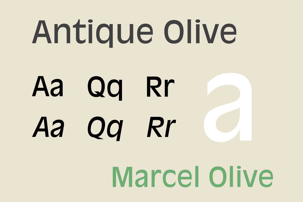
Antique Olive
Antique Olive is a distinctive sans-serif font designed by Roger Excoffon in the 1960s. Known for its unique, slightly condensed style and high legibility, Antique Olive offers a bold yet refined appearance that sets it apart from more conventional sans-serif fonts. Its rounded and robust letterforms make it particularly effective for headlines and display purposes, though it also performs well in body text for both digital and print media.
Antique Olive’s distinctive character has made it a popular choice for a variety of applications, including advertising, branding, and editorial design. Its versatility and clarity have led to its use in notable projects, such as signage for the French National Railway Company (SNCF). Despite being less common than some other sans-serif fonts, Antique Olive’s unique aesthetic and readability ensure that it remains a valued choice for designers seeking a typeface with both personality and functionality.
- Pros: Its unique, slightly condensed style makes it stand out while remaining clear and legible.
- Cons: Less common, which might lead to issues with availability or compatibility.

Arial
Arial is one of the most widely used sans-serif fonts, known for its simplicity, clarity, and high readability. Designed in 1982 by Robin Nicholas and Patricia Saunders, Arial was created to be a versatile and cost-effective alternative to Helvetica. Its clean lines and balanced proportions make it a popular choice for both digital and print media, including websites, documents, and signage.
Arial’s ubiquity can be attributed to its inclusion as a default font in many operating systems and software applications, making it accessible and familiar to a broad audience. Despite its widespread use, Arial remains a reliable and effective typeface for a variety of contexts, from professional presentations to everyday correspondence. Its straightforward design ensures that Arial continues to be a go-to font for those seeking a clear, neutral, and highly legible typeface.
- Pros: Universally available and highly legible, making it a safe choice for various screen sizes and resolutions.
- Cons: Some consider it overused and lacking character.

Avenir
Avenir is a modern sans-serif typeface designed by Adrian Frutiger in 1988. Known for its clean and harmonious design, Avenir has quickly gained popularity for its exceptional readability and elegant appearance. It is a versatile font that performs well in both digital and print media, making it a preferred choice for a wide range of applications, including branding, advertising, and corporate communications.
Avenir’s balanced and geometric shapes contribute to its contemporary yet timeless feel. It has been adopted by numerous high-profile brands and institutions, further cementing its reputation as a reliable and stylish typeface. Notably, Avenir is the official font for Apple Maps and is used in various public signage systems. Its combination of functionality and aesthetic appeal ensures that Avenir continues to be a top choice for designers looking for a sophisticated and versatile font.
- Pros: Modern and clean, Avenir offers great readability with a touch of elegance.
- Cons: It might not be available on all systems by default.

Futura
Futura is a renowned geometric sans-serif font, celebrated for its clean lines, modern aesthetic, and excellent readability. Designed in the 1920s by Paul Renner, Futura has become a staple in various design applications, from corporate branding to editorial design. Its precise, geometric forms give it a timeless quality that makes it suitable for both digital and print media, including brochures, posters, and books.
Futura’s popularity extends to iconic uses in various fields. It has been employed by major brands like Volkswagen and IKEA, and it famously appears on the commemorative plaque left on the moon by the Apollo 11 astronauts. Its blend of historical significance and contemporary appeal ensures that Futura remains a preferred choice for designers seeking a clean, modern, and versatile typeface.
- Pros: Geometric and clean, Futura’s clear lines make it highly legible, even at smaller sizes.
- Cons: The design might feel too modern for some contexts.

Helvetica
Helvetica is widely recognized as a classic sans-serif font, known for its clean, modern appearance and exceptional legibility. It has long been a favorite in various design contexts, including branding, advertising, and signage. Helvetica’s versatility extends to both digital and print media, making it a reliable choice for brochures, posters, and corporate documents.
In 1983, Helvetica was refined and re-released as Helvetica Neue, offering a more uniform set of weights and styles. This update solidified Helvetica’s position as a go-to font for many high-profile projects. Its enduring popularity is evident in its use by major corporations and institutions, including the New York City Subway system and the branding for American Airlines.
- Pros: Highly readable with a neutral, clean appearance that works well for various content types.
- Cons: Similar to Arial, it can be seen as overused.

Lato
Lato has been used in various physical publications, including information signs and election campaign billboards. It is the main font used on iCollege, Georgia State University‘s primary learning management system, and the official typeface of the Polish Government and the Polish bank Bank Pekao.
Lato has also been used for Chidusz, a Polish Jewish magazine and logotype of British international non-governmental organization (NGO) Save the Children since 2022.
- Pros: Offers a warm and friendly appearance while maintaining high readability.
- Cons: Less common than some other fonts, which could affect consistency across platforms.

Montserrat
Montserrat has gained popularity as a free alternative to other similar sans-serif fonts, such as Gotham or Avenir. While it is primarily seen on websites and online media, Montserrat’s high readability and ease of scaling make it suitable for printed materials, including brochures, signage, and books, as evidenced in the “Científicas de Acá” acknowledgments.
In 2018, Montserrat became the official font for documentation, presentations, and publicity for the Government of Mexico with the release of the 2018-2024 Graphic Identity Manual for the Presidential Office of Mexico. It is also used by the Legislative Assembly of the Vologda Region.
- Pros: Bold and modern, Montserrat stands out without sacrificing readability.
- Cons: The boldness can be overpowering in some contexts.

Open Sans
Open Sans is popular in flat design-style web design. Open Sans is used in some of Google’s web pages as well as its print and web advertisements. It is the official font of the UK’s Labour, Co-operative, and Liberal Democrat parties.
- Pros: Very versatile and readable, with a friendly and neutral design that works in many settings.
- Cons: Might feel too informal for some types of content.

Roboto
Roboto is a modern sans-serif typeface designed by Christian Robertson and released by Google in 2011. Praised for its clean, geometric shapes and excellent readability, Roboto has quickly become one of the most widely used fonts in digital interfaces and print media. Its balanced proportions and neutral appearance make it suitable for a wide range of applications, from websites and mobile apps to magazines and corporate communications.
Designed specifically for digital screens, Roboto performs exceptionally well at various sizes and resolutions. Its versatility and legibility on screens of all types have made it a preferred choice for user interfaces and digital content. Roboto’s extensive family includes multiple weights and styles, offering flexibility for different design needs while maintaining a consistent modern aesthetic.
Beyond its technical merits, Roboto has gained popularity for its contemporary look and user-friendly design. Its adoption as the default font for Android devices underscores its widespread appeal and effectiveness in conveying information clearly and efficiently.
- Pros: Designed for digital screens, Roboto is highly legible and versatile, making it ideal for subtitles.
- Cons: Its modern look might not suit all types of content.

Tiresias
Tiresias is a specialized typeface designed specifically for optimal readability, particularly for visually impaired readers. Developed by Dr. John Gill and colleagues at the Royal National Institute of Blind People (RNIB), Tiresias is engineered with distinct features that enhance legibility, such as generous letter spacing, large counters, and clear differentiation between letterforms.
The font’s design prioritizes accessibility, making it highly suitable for subtitles, signage, and any application where clarity of text is critical. Tiresias is available in both serif and sans-serif versions, catering to different visual preferences and reading contexts. Its application extends beyond digital screens to printed materials, ensuring consistency and ease of reading across various mediums.
Due to its thoughtful design and focus on accessibility, Tiresias has been adopted in contexts where readability is paramount, including government documents, educational materials, and publications aimed at improving accessibility standards. Its impact in enhancing readability for all readers underscores its importance as a specialized and effective typeface in inclusive design practices.
- Pros: Specifically designed for readability on screens, making it excellent for subtitles.
- Cons: Less well-known and might not be available on all systems.

Each of these fonts has its strengths and potential drawbacks. The best choice depends on the specific needs of your project, such as the type of content, the target audience, and the viewing medium.
Thanks for reading: “The Best Font for Subtitles: our top 10 picks!”
What are Progressive Web Apps (PWAs)?
10 Modern Web Design Trends for 2026
