High-performance web design requires building from the ground up. If you want a digital presence that feels bespoke, you have to write the code yourself. This tutorial breaks down three distinct header layouts architecture using internal assets and manual styling.
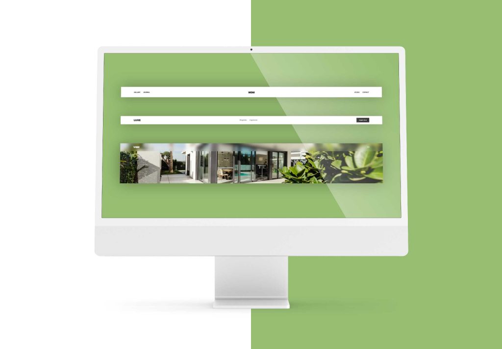
Header Layout 1: The “Split-Navigation” (Centered Logo)
This layout uses CSS Grid to create perfect symmetry with a centered logo flanked by navigation links. It is the standard for luxury boutiques and high-end portfolios.
The HTML
HTML
<header class="h-split">
  <nav class="nav-grid">
    <div class="nav-group">
      <a href="https://wedesignmarbella.com/what-we-do">Services</a>
      <a href="https://wedesignmarbella.com/work">Our Work</a>
    </div>
    <div class="logo-wrap">
      <div class="logo-icon">W<span>D</span>M</div>
    </div>
    <div class="nav-group justify-right">
      <a href="#contact">Consultation</a>
      <a href="https://wedesignmarbella.com/">Home</a>
    </div>
  </nav>
</header>
The CSS
CSS
.h-split {
  padding: 40px 0;
  background: #fff;
}

.nav-grid {
  display: grid;
  grid-template-columns: 1fr auto 1fr;
  align-items: center;
  max-width: 1400px;
  margin: 0 auto;
  padding: 0 40px;
}

.nav-group {
  display: flex;
  gap: 40px;
}

.justify-right { justify-content: flex-end; }

.logo-icon {
  font-size: 28px;
  font-weight: 800;
  letter-spacing: -1px;
}

.nav-group a {
  text-decoration: none;
  color: #000;
  font-size: 14px;
  text-transform: uppercase;
  font-weight: 500;
}
Header Layout 2: The “Action-Oriented” (Right-Side CTA)
A professional layout with navigation pushed to the center and a prominent call-to-action button. Ideal for real estate and lead-generation sites.
The HTML
HTML
<header class="h-action">
  <div class="container">
    <div class="logo">LUXE</div>
    <ul class="nav-links">
      <li><a href="https://wedesignmarbella.com/work">Projects</a></li>
      <li><a href="https://wedesignmarbella.com/services">Solutions</a></li>
    </ul>
    <div class="actions">
      <a href="#contact" class="btn-cta">Inquire Now</a>
    </div>
  </div>
</header>
The CSS
CSS
.h-action .container {
  display: flex;
  justify-content: space-between;
  align-items: center;
  padding: 20px 5%;
}

.nav-links {
  display: flex;
  list-style: none;
  gap: 50px;
}

.nav-links a {
  text-decoration: none;
  color: #333;
  font-weight: 400;
}

.btn-cta {
  background: #1a1a1a;
  color: #fff;
  padding: 14px 30px;
  text-decoration: none;
  font-size: 13px;
  font-weight: 600;
  transition: 0.3s;
}

.btn-cta:hover { background: #c5a059; }
Header Layout 3: The “Glass-Overlay” (Fixed UI)
A modern overlay designed for hero images using backdrop-filter for a frosted glass effect. Perfect for lifestyle brands and immersive landing pages.
The HTML
HTML
<header class="h-glass">
  <nav class="glass-nav">
    <div class="logo">WDM</div>
    <div class="menu-trigger">
      <div class="bar"></div>
      <div class="bar"></div>
    </div>
  </nav>
</header>
The CSS
CSS
.h-glass {
  position: fixed;
  top: 0;
  width: 100%;
  z-index: 999;
  background: rgba(255, 255, 255, 0.08);
  backdrop-filter: blur(20px);
  -webkit-backdrop-filter: blur(20px);
  border-bottom: 1px solid rgba(255, 255, 255, 0.1);
}

.glass-nav {
  height: 90px;
  display: flex;
  justify-content: space-between;
  align-items: center;
  padding: 0 5%;
}

.bar {
  width: 25px;
  height: 2px;
  background: #fff;
  margin: 5px 0;
}
Interactive Scroll Logic
To handle header transitions during scrolling, use this lightweight JavaScript snippet:
JavaScript
const header = document.querySelector('header');

window.onscroll = () => {
  if (window.scrollY > 100) {
    header.classList.add('active');
  } else {
    header.classList.remove('active');
  }
};
Elevate Your Digital Standards with custom Header Layouts
Standard templates are for standard businesses. If you want a website that actually performs, you need a custom-coded solution that prioritizes manual precision.
At We Design Marbella, we build specialized, sustainable, and modern WordPress sites that stand out. Ready to see the difference hand-coded expertise makes?
- View our recent projects: Our Work
- Explore our specialized solutions: Services
- Get a custom build: Contact Us
